SEO-Friendly Navigation and Menus: Best Practices

We’ve all been there — when we go to a site and immediately feel lost and overwhelmed. This confusion often stems from poor web navigation, which plays a critical role in both user experience and a website’s visibility. Navigation isn’t just a design feature; it’s a fundamental element of SEO success.
When a site lacks structure, both users and search engines struggle. This leads to higher bounce rates and lower rankings. Conversely, well-organized navigation serves as the foundation of an effective user journey and robust SEO strategy. When menus and links are aligned with SEO goals, users can easily find what they need, and search engines can efficiently index and rank the site.
Let’s explore how strategically placed menus improve SEO and user experience.
What is website navigation?
Website navigation refers to the system that organizes and presents links on a website, allowing users and search engine bots to move between pages and access content efficiently. Effective navigation includes menus, headers, footers, and sidebars, which enhance usability and improve user experience by making information easy to find.
These elements work together to create a cohesive and intuitive structure, allowing users to navigate your website effortlessly. This organized layout not only improves user navigation but also helps search engines crawl and index the site effectively, contributing to better search rankings.
Sitemaps and strategically placed internal links further enhance content organization by presenting it in a clear and logical manner. This structure not only makes your website more user-friendly but also improves its search engine optimization (SEO), resulting in better visibility and performance in search results.
Why does paying attention to website navigation matter?
Effective website navigation is critical for both SEO and visitor interactions. A user’s first impression of a website often depends on the simplicity and strategic design of its navigation. A clear and well-structured navigation provides a great user experience, encouraging users to explore the site further and engage with its content. Here are key reasons why navigation is crucial for websites:
1. Creating strong first impressions
A clean and intuitive layout leaves a positive first impression, fostering engagement. When users can find what they need quickly, they are more likely to stay on the site and explore additional content.
2. Improving SEO performance
Navigation elements, such as headers, play a vital role in improving a site’s indexability. A well-organized structure helps search engines crawl, map, and categorize your content effectively, leading to better search engine rankings.
3. Enhancing user experience
Clear and straightforward navigation improves user interactions by guiding visitors effortlessly to relevant information. A seamless experience increases the likelihood of return visits and builds user trust.
4. Driving higher conversion rates
Thoughtfully designed navigation makes conversion actions—such as signing up, making a purchase, or contacting your business—intuitive and easy to find. This accessibility significantly increases the chances of converting visitors into customers.
How people navigate sites
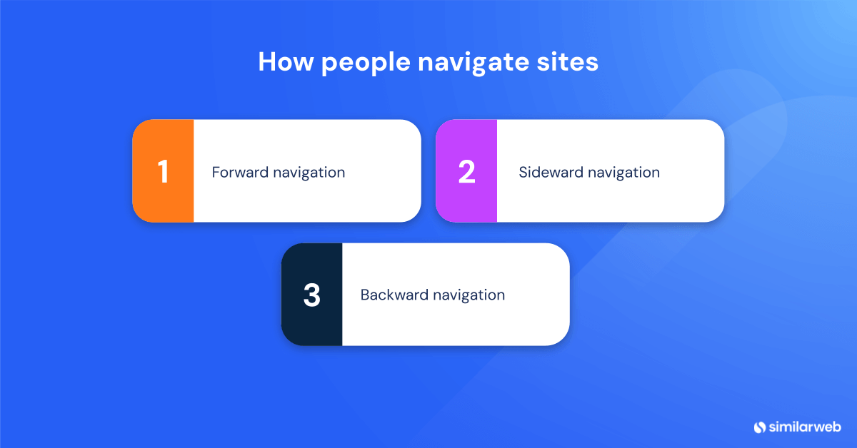
Studying user movement on websites uncovers unique navigation patterns, which are essential for designing a user-centric interface. By understanding these behaviors, you can create navigation systems that accommodate various browsing styles:
1. Forward navigation
Users typically follow a linear path, moving from general content to more specific pages. This progression often starts on the homepage and transitions to detailed sections, similar to starting with an overview in a book and then diving into specific chapters.
2. Sideward navigation
This type of navigation involves moving between related content within the same thematic category. For example, a blog post linking to another post on a similar topic keeps users engaged within the same environment, extending their stay without overwhelming them.
3. Backward navigation
Features like breadcrumbs make it easy for users to backtrack and revisit previous pages. These tools reduce friction and encourage deeper exploration by simplifying the retracing of their browsing path.
Common website menu types and their role in SEO
Creating an exceptional website isn’t just about aesthetics—it’s also about usability. Well-structured navigation is critical for both user satisfaction and search engine rankings. Effective navigation ensures that users can easily find what they’re looking for and increases the likelihood of your site appearing in search results. Let’s explore the main types of website menus and their role in SEO success:
1. Header navigation
The header is one of the most visible and frequently used parts of a website, typically located at the top of every page. It directs visitors to key sections of the site, such as product categories, services, or contact information. For search engines like Google and Bing, a structured header improves crawlability and indexing by highlighting important links.
A well-designed header also supports on-page SEO by embedding relevant keywords within menu links. This approach enhances navigation for both first-time visitors and returning users while making important pages more accessible and boosting your site’s overall SEO performance.
2. Footer navigation
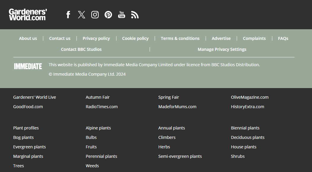
Often overlooked, the footer serves as an additional navigation tool, providing links to essential pages that might not be included in the main menu. Common examples include links to privacy policies, terms of service, FAQs, and ‘About Us’ pages. These links build trust with visitors while improving their overall site experience.
From an SEO perspective, footers are valuable for linking to less prominent but still important areas of your site without cluttering the main navigation bar. They complement internal linking strategies, support structured data, and provide another opportunity to include relevant keywords, helping improve your site’s search performance.
3. Dropdown menus
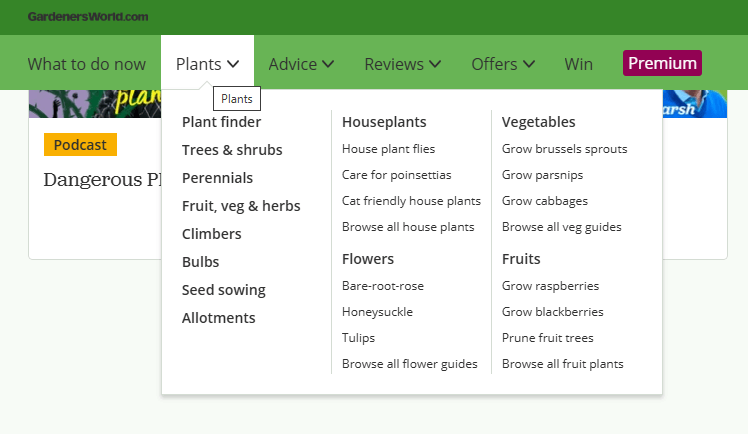
Dropdown menus are essential for organizing content effectively and creatively. These menus expand to reveal additional sub-menu options when users hover over or click on primary menu items. This structured design streamlines the main navigation and facilitates seamless transitions between related sections.
From an SEO perspective, incorporating keywords into dropdown labels and anchor text enhances the context and relevance of the linked material. This approach not only improves search engine visibility but also encourages users to explore further, strengthens site hierarchy, and optimizes the overall navigation structure.
4. Mega menus
Mega menus are ideal for websites with extensive content libraries, such as e-commerce platforms. These comprehensive dropdowns accommodate a wide array of categories, often including text, images, and links, making large volumes of information easy to navigate.
By fostering user engagement and improving content discoverability, mega menus enhance the user experience and align with SEO objectives. Their structured format helps search engines prioritize content while showcasing the site’s depth, delivering immediate access to valuable resources, and solidifying the site’s hierarchy.
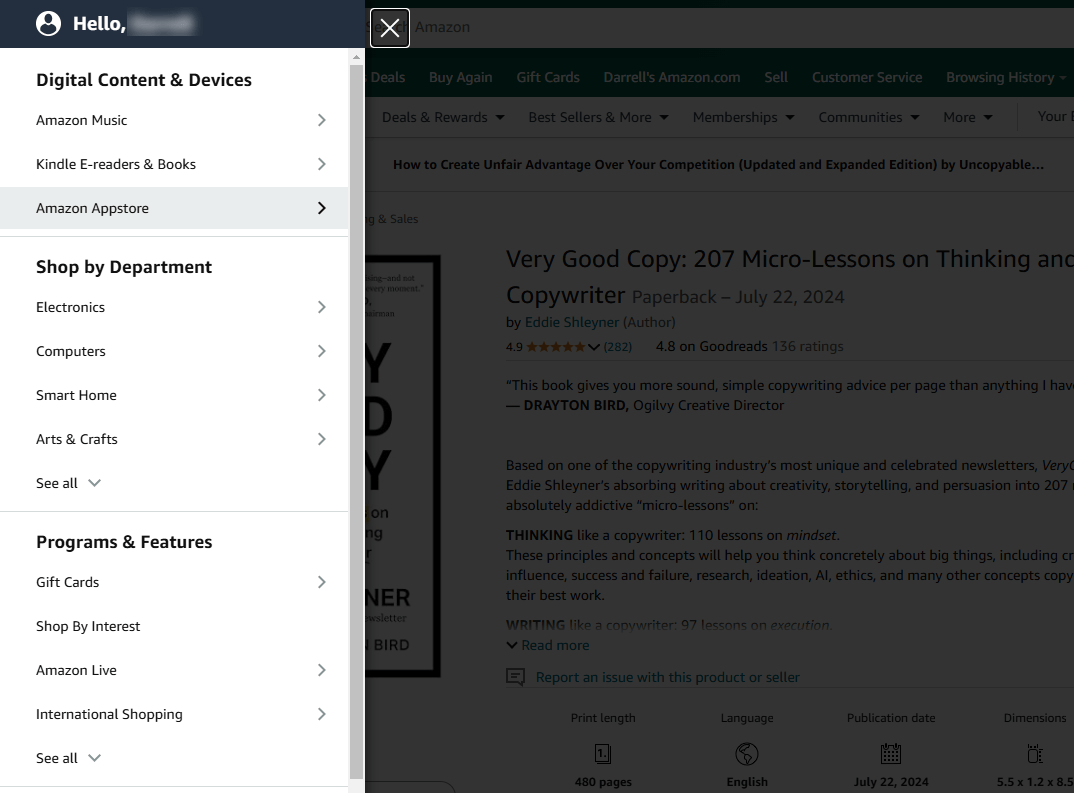
5. Hamburger menus
Hamburger menus compress navigation into a compact icon, making them indispensable for mobile-friendly design. Despite concerns about their impact on user engagement, these menus are crucial for responsive websites. Strategically embedding SEO-focused keywords within their structure can bolster on-page optimization efforts.
Hamburger menus are versatile, functioning seamlessly across mobile and desktop devices. This adaptability enhances accessibility, reduces bounce rates, and encourages users to delve deeper into your site’s content, ultimately supporting both usability and SEO goals.
6. Tabbed menus
Tabbed menus enable users to quickly switch between related sections, making them particularly effective for feature-rich applications. Much like a filing system, they keep information organized and readily accessible, offering an intuitive user experience.
To maximize SEO benefits, include keywords in tab titles and implement schema markup for tabbed content. This approach improves search engine indexing and enhances the navigational structure. Tabbed menus contribute to a smoother user journey and stronger on-page SEO performance by simplifying access to detailed information.
Non-menu navigation
Beyond traditional menus, non-menu navigation options provide unique and effective ways for users to interact with a website. These methods are essential for enhancing usability, improving SEO, and delivering a seamless user experience. Here are some key types of non-menu navigation:
1. Faceted navigation
Faceted navigation allows users to filter products or services based on specific criteria, such as brand, price, or color. Commonly found on ecommerce websites, this interactive design significantly enhances user experience by helping visitors quickly find what they need.
From an SEO perspective, faceted navigation can create challenges like duplicate content. To address these, canonical tags and proper indexing strategies should be employed. When implemented correctly, faceted navigation strikes an ideal balance between user-friendliness and SEO optimization.
2. Anchor link navigation
In-page anchor links enable users to jump directly to specific sections of a page, saving time and reducing unnecessary scrolling. They are especially useful for longer pages, such as articles or FAQs, where quick access to information is key.
Effective anchor text not only improves navigation and readability but also supports an internal linking strategy. These links help search engines better understand page structure, contributing to improved indexing and SEO performance.
3. Hierarchical navigation
Hierarchical navigation uses a clear parent-child structure, often displayed as breadcrumbs. This approach helps users and search engines understand the site’s architecture and easily navigate from broader categories to more specific content.
By organizing content into a logical hierarchy, this method provides users with straightforward paths through the website while ensuring comprehensive search engine indexing. Hierarchical navigation simplifies exploration and enhances both usability and SEO.
4. Related navigation
Related navigation connects users to content with similar themes or topics, typically linking pages within sibling categories. This approach encourages users to explore more of the site, increasing engagement and time spent on the website.
Strategically linking related content strengthens the internal linking network, benefiting SEO and boosting conversion rates. This cohesive content strategy enhances user interaction while improving overall site structure and performance.
5. Pagination navigation
Pagination divides content into smaller, more manageable sections, making it easier for users to navigate lengthy blogs, articles, or extensive product lists. This approach helps users move smoothly between sections while maintaining their engagement and interest.
Effective pagination prevents the dilution of link equity and ensures a seamless user experience. Tags like ‘next’ and ‘prev’ signal the content flow to search engines, improving indexing efficiency. By supporting on-page SEO efforts, pagination enhances both usability and search visibility.
13 website navigation best practices for SEO
Effective website navigation is key to guiding visitors through your content and ensuring your site aligns with search engine expectations. A user-friendly interface enhances engagement while improving SEO by helping search engines understand your site’s structure. These strategies can boost user interaction, extend session duration, and improve rankings.
Let’s dive into the best practices:
1. Make your navigation intuitive
Navigation should feel natural, like turning pages in a book. If users encounter difficulties finding what they need, they’re likely to leave. A clear and intuitive layout reduces bounce rates, increases time spent on your site, and directly impacts search rankings.
2. Keep menu options concise
Simplify your menu by avoiding excessive options, which can lead to ‘analysis paralysis.’ Focus on key actions to improve user experience and guide visitors efficiently. A streamlined menu enhances usability, promotes link equity flow, and strengthens your SEO strategy.
3. Use mega menus for large sites
For websites with extensive content, mega menus organize links under a unified structure, making navigation easier for users and search engines. Mega menus support internal linking and improve indexing while providing a streamlined experience.
4. Use descriptive anchor text
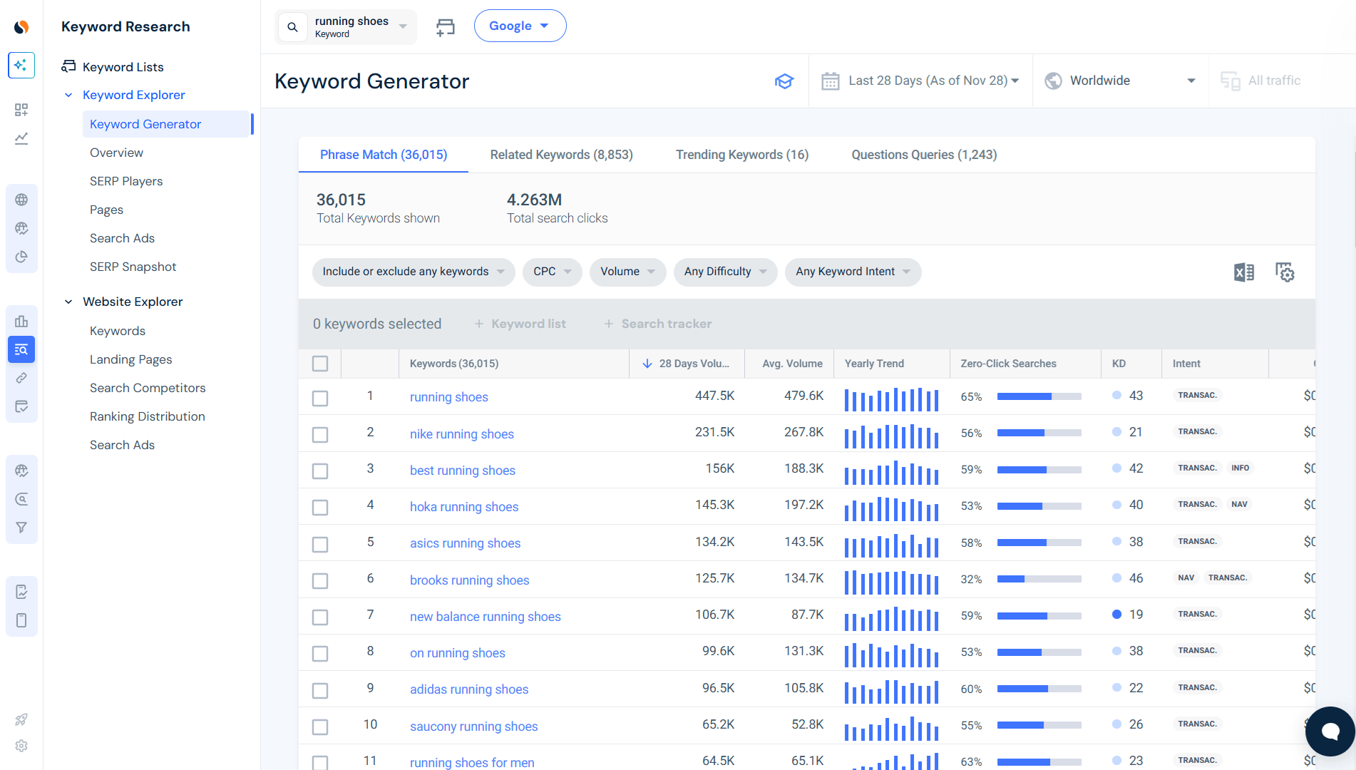
Anchor text should be clear and descriptive, effectively guiding both users and search engines. This approach enhances usability and supports on-page SEO by aligning the anchor text with relevant keywords, resulting in a seamless browsing experience. By matching your keyword strategy, anchor text not only improves navigation but also strengthens your site’s SEO performance. Tools like Similarweb’s Keyword Generator can help identify high-performing keywords and create anchor texts that align with user intent.
5. Prioritize pages by popularity
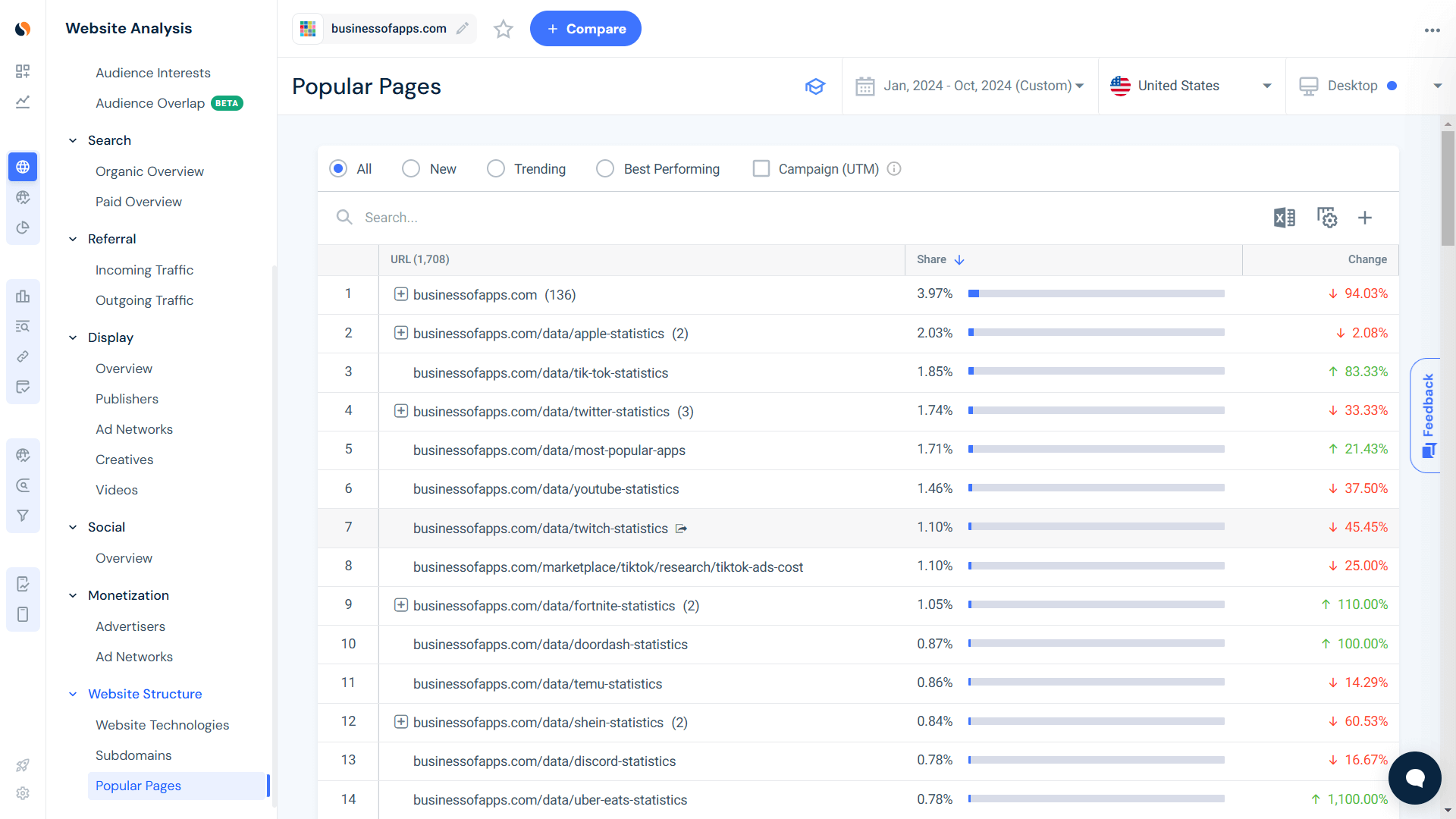
Be strategic by prioritizing your pages based on popularity metrics. Similarweb’s Popular Pages feature provides a simple and fast way to discover your most popular content and most viewed pages. Placing highly visited pages on top of your menu improves both UX and internal linking structure.
Compelling content attracts visitors, increasing the likelihood of sharing and linking. This boosts the page’s authority and enhances its SEO potential. By immediately connecting users with relevant information, this approach improves engagement, encourages participation, and enhances overall user satisfaction.
6. Build navigation around content hierarchy
A well-organized site is built on a clear and logical content hierarchy. Structuring your site into categories and subcategories aligned with your content and SEO strategy is essential. Users should naturally flow through the hierarchy to find information without confusion.
Reflect this hierarchy in your main menu to provide a logical path for users. A structured content approach not only enhances user satisfaction but also maximizes search engine indexing, serving as a powerful factor for improving both user experience and SEO outcomes.
7. Separate CTAs from navigation
Maintain a clear distinction between navigation elements and CTAs to avoid confusion. Navigation helps users explore your site, while CTAs prompt specific actions. Blurring the lines between the two can lead to confusion and negatively affect your conversion rate.
Instead, position CTAs as explicit, standalone elements that are attention-grabbing yet non-intrusive. This approach ensures CTAs prompt the desired actions while preserving the integrity of your site’s navigation flow.
8. Use breadcrumbs
Breadcrumbs act as a secondary navigation system, helping users trace their path through your site. They display the user’s current location and offer an easy way to navigate back to previous pages. Breadcrumbs improve user experience by simplifying navigation while also supporting SEO.
By providing additional indexing paths for search engines, breadcrumbs enhance your site’s visibility in search results. Websites that implement breadcrumbs typically see improved user retention and higher search visibility, contributing to a better overall user experience.
9. Link between categories
Internal linking is a cornerstone of effective SEO and user experience. Linking relevant content across different categories not only creates a seamless navigation experience but also distributes link equity evenly across your site.
Internal links guide users to related content, encouraging them to stay on your site longer and explore further. This practice boosts SEO by increasing page authority, facilitating user navigation, and driving greater engagement.
10. Avoid URL parameters
URL parameters can complicate navigation and hinder SEO. They obscure URL clarity and may create challenges for search engines during indexing. Instead, opt for static URLs that are straightforward and keyword-rich.
Static URLs are more reliable, easier for users to understand, and better aligned with SEO best practices. They contribute to a clear site structure, effective keyword usage, and a smooth navigation experience.
11. Limit JavaScript usage
Excessive use of JavaScript can negatively impact both navigation and SEO. Search engines often struggle to process JavaScript-heavy content, which can result in incomplete indexing.
To avoid these issues, prioritize HTML and CSS for navigation elements. This approach ensures compatibility with search engines, enhances code transparency and improves indexing efficiency.
12. Optimize for mobile devices
With mobile devices accounting for over 60% of website traffic (StatCounter), mobile-friendly navigation is no longer optional. Responsive menus that adapt seamlessly to different screen sizes are key to improving both mobile SEO and conversion rates.
By prioritizing mobile-first navigation, you provide device-appropriate user experiences, reduce bounce rates caused by poor mobile design, and enhance overall user satisfaction. A mobile-focused strategy is crucial for your website’s long-term success.
13. Test navigation regularly
Conduct regular testing of your site’s navigation to ensure it remains user-friendly, effective, and aligned with SEO best practices. Incorporate technical SEO audits into this process to uncover hidden issues and identify opportunities for improvement.
By using SEO tools and gathering user feedback, you can address evolving user behaviors and industry trends. Routine evaluations keep your navigation responsive and robust, ensuring your site remains competitive, user-centric, and optimized for search engine performance.
Revamp your navigation for better results
Optimizing your site’s navigation is key to unlocking its full potential. Thoughtfully designed navigation enhances user experience while boosting SEO performance. With insights from Similarweb, you can better understand your users’ behaviors and refine your strategy to align with their needs.
Streamline your website’s navigation to ensure it works seamlessly for both users and search engines. Learn how Similarweb can accelerate your digital strategies and make your SEO efforts more impactful than ever.
FAQS
What’s the first step in creating intuitive navigation?
An intuitive navigation design starts with knowing your users. Integrate familiar labeling, making navigation options readily available and visible, and primarily focus on a clear, streamlined structure.
How do mega menus support large sites?
Mega menus keep expansive links under one roof, making it easier for users to navigate. They streamline, upgrade, and polish the striking aesthetics of large sites to improve the user journey and SEO execution.
Why is mobile navigation optimization crucial?
Having a high share of web traffic coming from mobile devices, the needed mobile-focused ranking strategy offers a seamless user experience. Responsive designs save you from high bounce rates and increase user delight, which are key elements in a compelling SEO.
Why should URL parameters be avoided?
Clean URLs improve UX and search engine ranking. They make your website easy to navigate and preserve clarity, contributing to its professional appearance.
How do internal links influence user journeys?
Internal links guide users to related content, improve interaction, and improve site SEO. By intertwining key relevant sections, they provide an integrated user journey.
Track Gen-AI And Organic KPI's On The #1 SEO Platform
Give it a try or talk to our marketing team - it’s free!


