Metrics that Matter – A/B Testing Your Website Properly

No matter how experienced you are in marketing and how well you think you know your customers, human behavior can always surprise you. This is why the marketing gods created a foolproof method to figure out what content best speaks to your customers.
During his 2012 successful presidential campaign, former President Obama’s team ran more than 500 A/B tests on his website. That led to a 49% increase in online donation conversions and a 161% increase in sign-up conversions.
Website A/B testing is a key element in your digital marketing strategy. It gives you actionable data about the user experience on your website, how you can improve your website, and increase leads to conversions.
What is A/B testing?
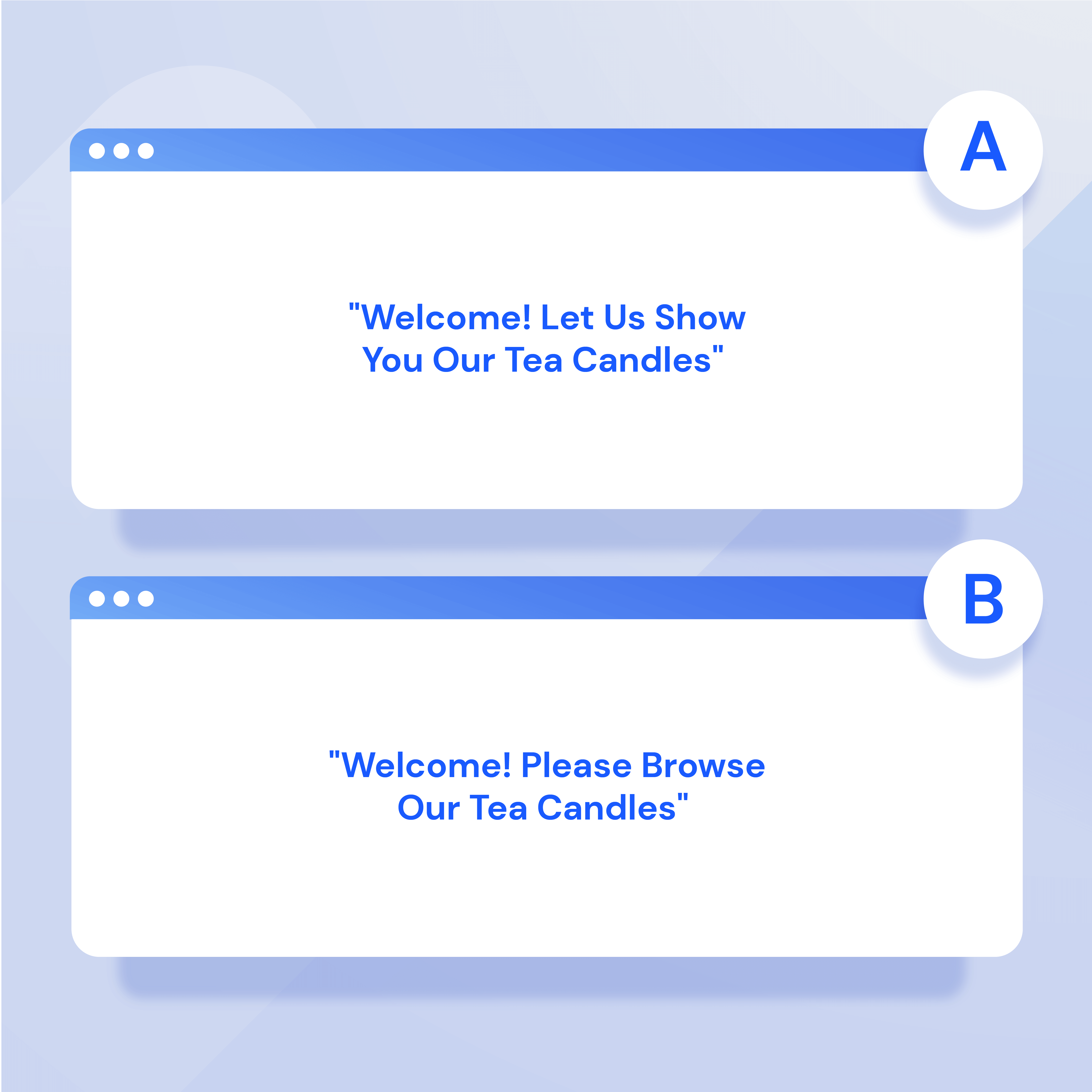
A/B testing is when you create two versions of a piece of content with one clear difference, i.e., one has an emoji and the other doesn’t, or one version is in video form and the other is text only (but the same content). Part of your audience will see one version, while the other part will see the other. Whichever version gets more engagement and conversions is the winner. And most importantly you can understand your audience better.
How to do A/B testing on your website
Choose a testing variable
First things first: Decide what you’re testing. You can choose a specific landing page, a product page, your sales checkout page, or any other website page you want to optimize. With each A/B test, choose one variable. While it may be tempting to create two extremely different versions of the page, this won’t help you figure out what works. You won’t know whether it was the font, a button’s color, or the messaging that had the impact. Start with one variable and once you’ve finished that test, you can test another.
A few variables you can test are:
- Copy: What is the tone of the page? You could write your copy with two different tones to see which keeps audiences engaged longer. One page could have a more professional tone, while the other a friendly, less formal one.
- Call to action: What causes people to click? For example, if you’re A/B testing a newsletter sign-up page you could try “Sign Up For Our Newsletter” and “Yes! I’m in!” Whichever CTA got more newsletter sign-ups is better.
- Design: A page’s layout is critical. The way a page looks has a huge impact on conversion, so you could do tons of design A/B testing. You could test different fonts, layouts, color schemes, and other design elements of your page.
- Images: Do your website visitors prefer stock photos or cartoons and icons? You can try different types of images or different stock photos. Maybe your audience isn’t as into cat photos as you thought and you could get more conversions with dogs.
Determine winning criteria
As with every competition, A/B testing needs specific criteria that will determine the winner. For website A/B testing, you might choose some of the following criteria to judge your winners:
- Click-through rate: A CTR is how many clicks you received per total number of impressions. For example, if a PPC ad you are running on Google receives 5,000 impressions and 200 clicks, your CTR is 4%. If you’re A/B testing ads, the winning ad would be the one with a higher CTR.
- Leads: Let’s say you’re A/B testing a landing page for a lead magnet. The goal of this page is to get visitors to convert. Your winning landing page would be the one that generates more leads.
- Session duration: Session duration is how long a person spends on your website. Obviously, the longer the duration, the better for you! If you want to improve session duration, you can test how your A/B testing variables affect this.
- Conversions: A conversion is whenever a website visitor performs a desired action. Maybe you want them to buy something, click on a specific button, or provide their email address. See how altering your variables affects conversions!
- Bounce rate: Your bounce rate is how many people leave your site after only seeing one page. You can test variables to see what lowers your bounce rate. Who knows, maybe a font change will stop people from leaving your page!
Create a test page
Start with your “control” page. This is the original version of the webpage. It could be a page that is already live on your website or a new page you’re creating for a new purpose. Next, you can create your test page. This page is basically a copy of the control page, but with one difference: your chosen testing variable.
Prime example: You decide to test out two different calls to action to see which leads to more clicks. First, create two similar pages, with the one difference being the call to action.
Structure your test
Now that you have your two pages for A/B testing, you have to structure your test. This includes determining how you will split website visitors see each page, sample size, testing period, and statistical threshold.
There are many tools you can use to set up your test, depending on how you’ve built your website. You should know how many website visitors you regularly get on your control page, so if you split this in half that will tell you how many website visitors will see each of the different versions of the page.
With this knowledge, you can decide how long you’ll run your test based on how many people you want to see on each page.
For example, let’s say you have an average of 20 people visiting your landing page per day. Split in half, this means that 10 people will see each of your two pages during the test every day. If you want 100 people to see each page, your test should take 10 days.
Statistical significance
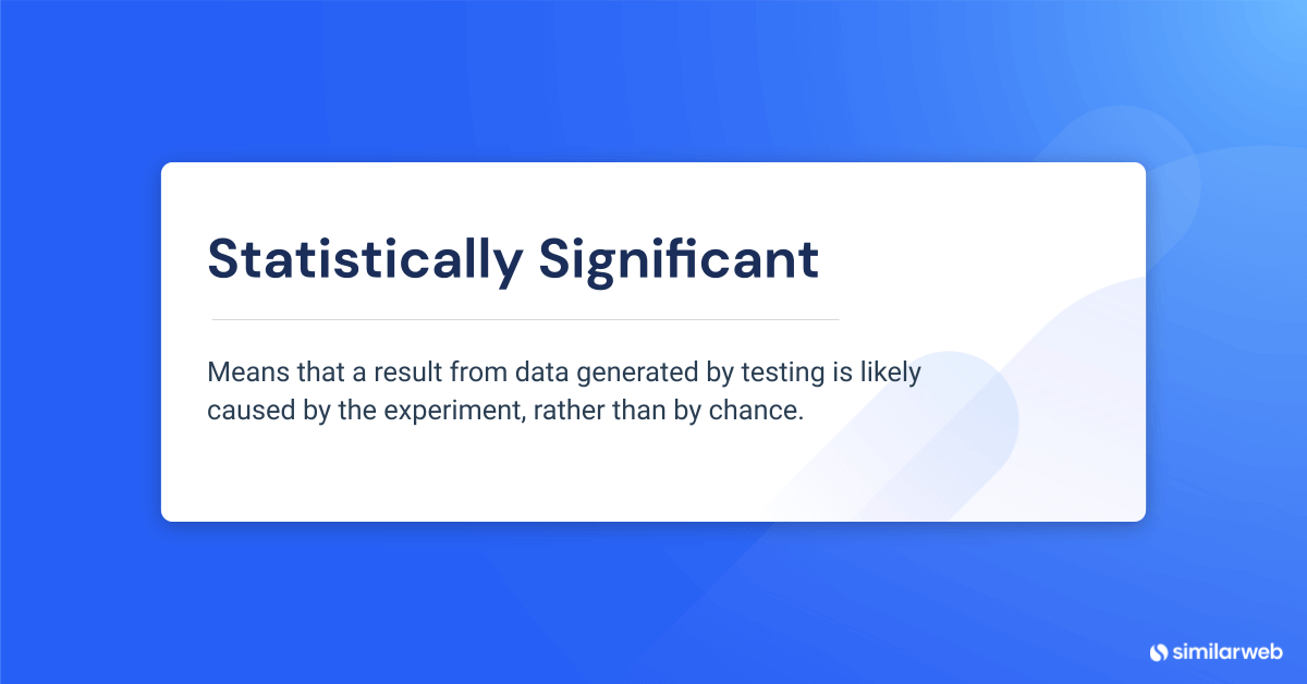
The next part requires a little math. You need to decide how significant your results should be. It would make things much easier if one page had a 20% conversion rate and the second had a 60% conversion rate. Your test would show a very clear winner. But most likely, your test results won’t be that different, especially when testing small variables such as font or CTA. More likely, you might see that one page had a 45% conversion and the other page a 55% conversion. How do you know if this is significant or a product of chance?
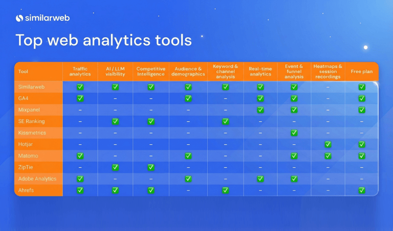
To understand the statistical significance, you’d have to calculate the standard deviation and p-value of the data. Feeling lost? You can use website A/B testing tools like:
It’s important when you choose the page you’re testing, to choose a page or content that gets significant website traffic to get accurate results
Measure and analyze results
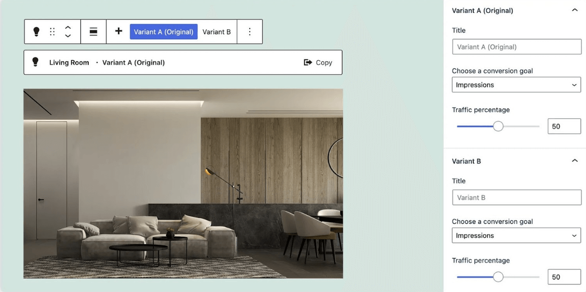
The results are in! Once your test is over you need to analyze the results. You can use a tool such as Google Analytics to get the metrics of your different pages to determine the winner. If your site runs on WordPress, tools such as Altis A/B testing blocks open up a world of possibilities, enabling you to automatically run multiple variants of a single piece of content against different audience segments.
Lather, rinse, repeat
You just discovered some valuable information about what improves conversion on your website. Why stop there? You can now create a new A/B test to test a second variable and further improve conversion. Let’s say you know which CTA is better, so how about testing different headlines?
Once you get the hang of it, you can even start creating extra test pages. For example, you’ll have your control page, but then you’ll create two test pages to test two different calls to action. Or two different headlines. You can test multiple options for the same variable as your A/B testing gets more complex.
A/B testing website examples
There are infinite things you can A/B test on your website – here are a few A/B tests you should try out.
Typography
Typography is one of the most important factors on your website when it comes to content. People are looking for content that is easy to read and won’t give them a headache. While what you write is important, how you write it also matters.
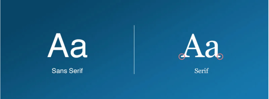
There are hundreds of different fonts you can use. You probably aren’t going to do A/B testing for each one, but you can test different types of fonts, for example, Serif vs. San Serif.
Serif fonts are considered more traditional, while sans serif is more modern. Which type speaks to your audience? You can A/B test this, and then start testing other fonts within the preferred type.
Within typography, you can also test font color and size. Generally, with long content, you want to use a black font, but you might find that your headlines work better in another color. With size, larger tends to be easier to read, but bigger isn’t always better. Still with me?
Calls to action
We already mentioned testing the text of your CTA, but what about the position and design? This can have a huge impact on a page’s engagement metrics.
Should you place the CTA at the top of your page? Have you tried a floating button? What about placing it on the left, right, or center?
The position of the button and how it relates to the rest of the page can have a huge impact on clicks.
You can also test its design. Would a red or green button lead to more clicks? Or maybe you design your button to look 3D rather than flat. There’s only one way to find out…
Background
Your website’s background has a subliminal effect on visitors. Try different images, colors, and even patterns to see what your audience prefers.
Images
The way a product or offer is displayed can be one of the pivotal elements that factor into a website visitor’s decision to continue engaging with your content or drop off. What about trying different styles of imagery for visitors from different regions around the world to see what resonates? Or experiment comparing different imagery styles such as stock photos to illustrations?
You can test a variety of images across your audience segments to see what improves your click-through rates and time on page.
Text and tone
Test different text lengths (short and concise vs. a longer, more story-like form) to see what improves session duration or conversions.
You should also try switching up the tone. Maybe you write with lots of exclamation points or you try a different version that is more formal.
Sign up form
You’re not off the hook yet. It’s not over until your visitors convert or leave your website. So, what’s left? A/B test different forms. You can test different numbers of fields (usually less is better, but you’ll only know if you test!) and different types of input forms (open-ended, dropdowns, radio buttons, or checkboxes).
People often drop off processes in the middle of filling out forms, so anything you can do to ease them toward pressing the submit button will be hugely beneficial.
Ready to dip in and A/B test the waters?
Often, what responds best to your audience will surprise you. While your common sense and experience might tell you something is better, we recommend not relying on these feelings for your content marketing strategy. Data is an infinitely better reason to do something than a gut feeling.
You never know what you’ll find. But you can be sure that you’ll improve your website metrics, and ultimately, your sales.
Your full marketing toolkit for a winning strategy
The ultimate solution to help you build the best digital strategy






![GEO Framework For Growth Leaders [+Free Template]](https://www.similarweb.com/blog/wp-content/uploads/2026/02/attachment-growth-leader-geo-decision-framework-768x429.png)


