Web Traffic Heatmaps: Firing Up Sector Macro Trends

What happens when you look at this?
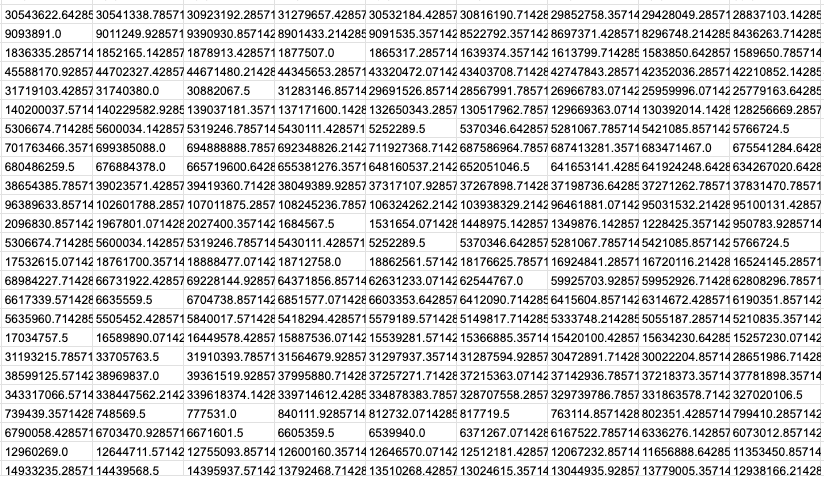
I can picture it now. You squinted your eyes, moved in for a closer look, and pushed your nose against the screen. Did it help? No?
What happens when you look at this?
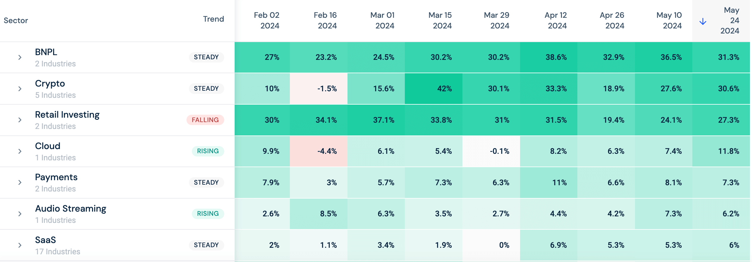
I can picture it now, the lightbulb above your head as you scan the data and sector macro trends become clearer. Web traffic in the BNPL sector was steady, and Cloud and Audio Streaming traffic increased. A clear picture cultivated from alternative data.
The amount of data in front of you takes time and resources to analyze. That’s where the value of heatmaps comes in.
What are heatmaps?
A heatmap is a graphical representation of data that utilizes colors to represent different values. A heatmap can be used to represent a wide variety of data sets, from unemployment rates to real estate and, of course, web traffic.
A great example of a heatmap, is Similarweb’s web traffic heatmaps. These were originally created to track consumer recovery across multiple sectors and took off from there, with deeper and broader coverage in sync with the rapidly evolving pace of online innovation.
What are the benefits of heatmaps?
Data visualization is a key benefit of heatmaps. This allows anyone to understand what the data is saying without having to dig through rows upon rows of numbers. The news media uses them frequently. A perfect example is during election coverage, like this one from the New York Times published during the 2018 midterm elections.
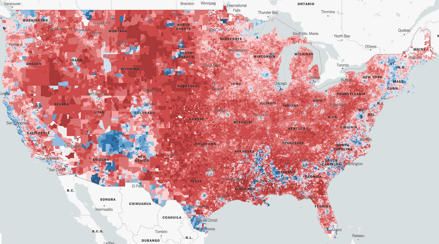
Red equals Republicans, and blue represents Democrats, and readers get a good feel for the makeup of the country and how they may vote come election day.
How do investors use heatmaps?
The subject of the heatmap will determine how investors use it.
Stock heatmaps allow investors to make informed decisions by identifying stocks that meet specific criteria, such as the highest or lowest returns, highest volume, or strongest price momentum.
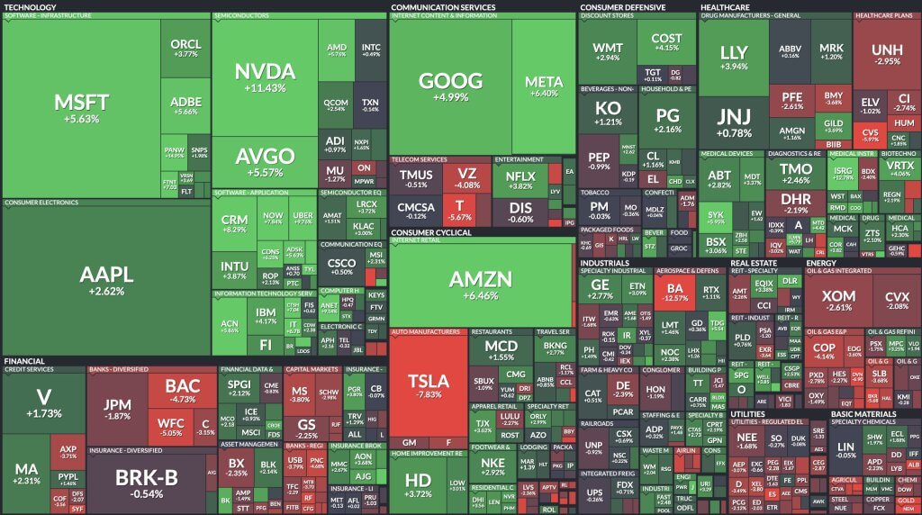
Overall portfolio analysis is an investment heatmap commonly used. Investors can visualize the performance of different assets or securities held within a portfolio, not just over a single time frame, but over all time frames to quickly identify areas of high risk and adjust accordingly.

But, the better question is — How Similarweb transforms its alternative data into heatmap form for investors?
Similarweb Stock Intelligence Web Traffic Heatmaps
Yes, it’s a mouthful. But, these heatmaps provide quick insight into sector macro trends built from web traffic data to a sampling of domains in the specific industries that make up a sector.
Scratching your head? No need. Let’s break this down by looking at the SaaS sector.
On Similarweb Stock Intelligence, the SaaS sector is made up of 17 industries, one of which is Communication. This industry is made up of 23 domains.
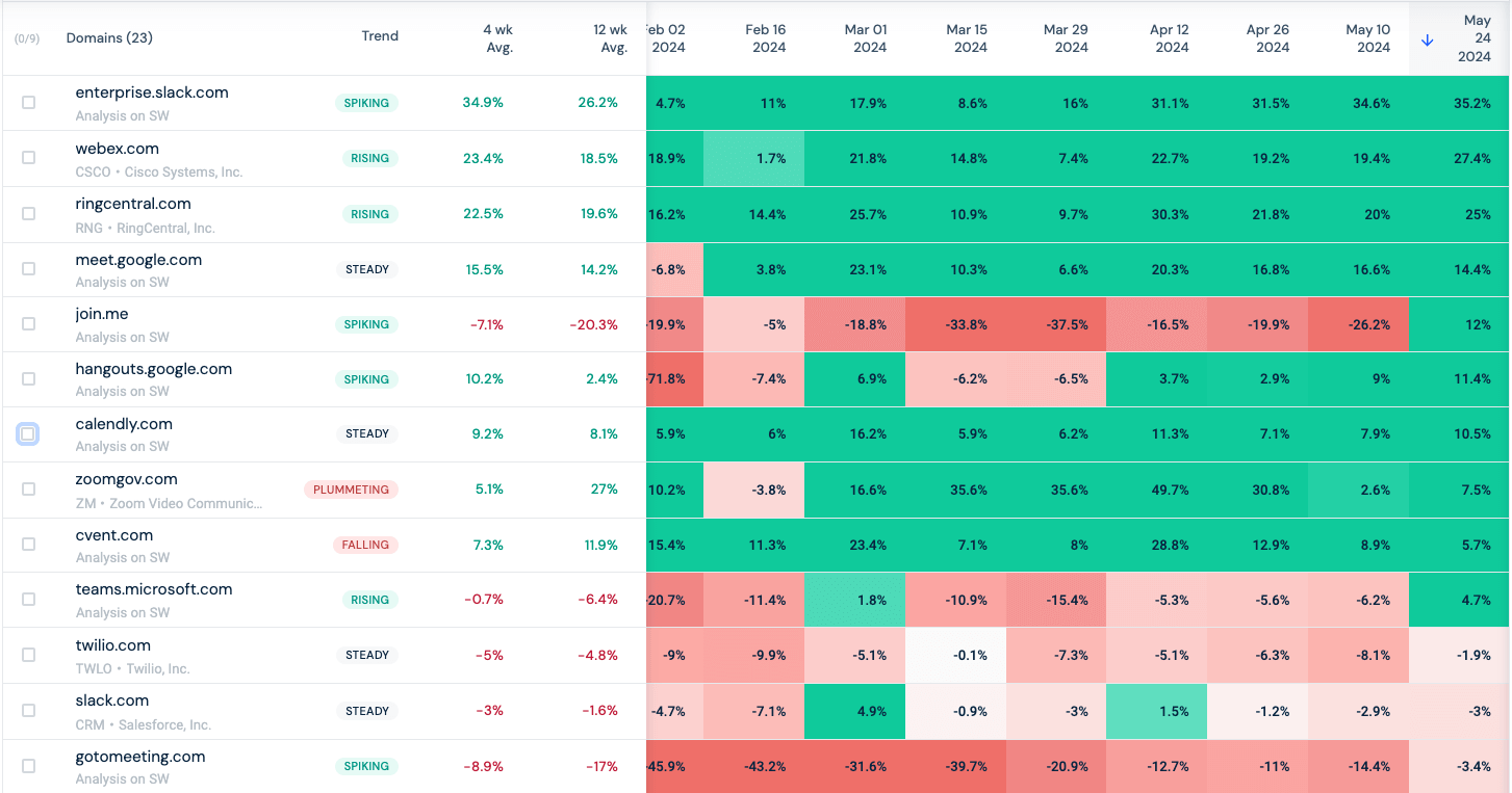
On initial glance, it’s easy to glean traffic fluctuations to the various domains. Evaluating further, investors can start to determine which domains are the key players in a given industry and which companies are up and coming.
- Enterprise.slack.com total visits were up 8.7% comparing 4- and 12-week trends
- Hangouts.google.com total visits were up 7.8% comparing the same trends
On the flip side:
- Zoomgov.com traffic fell dramatically, down 21.9% comparing the 4- and 12-week trends
- Cvent.com traffic dropped 4.6%
Zoom.us and web.skype.com traffic remained steady.
The web traffic to these domains determines how the Communication SaaS industry is doing, which is currently steady, meaning traffic fluctuation is under 2%.
Now let’s look at the industries that make up the SaaS sector.
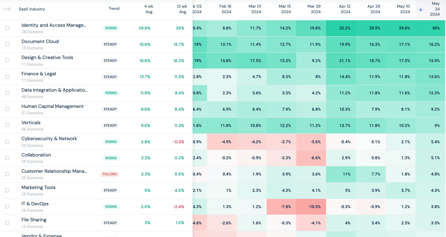
There are 17 industries that make up this sector, including Communication, and we know the traffic is currently steady.
- Five industries that make up the sector have web traffic that is on the rise, including Identity & Access Management (up 3.9%), Data Integration & Applications (up 2.5%), and Collaboration (up 3%)
- Customer Relationship Management Tools is the only industry in the sector that has declining web traffic (down 2.2%)
- The web traffic for the remaining 11 industries is steady
What does this mean for the SaaS sector?
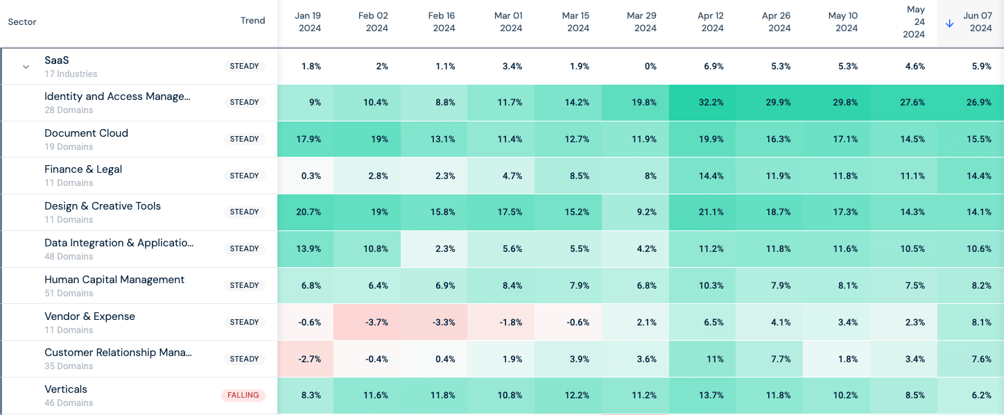
Web traffic to the sector as a whole is steady.
Now, investors have a clear picture of the SaaS sector, the macro trends driving it, and the key industry players making waves within it. More importantly, the insights derived from the web traffic heat maps took only a few minutes.
Ignite your investment strategy with heatmaps
Similarweb Stock Intelligence Web Traffic Heatmaps, updated every two weeks, provide fast and easy analysis across 28 sectors, 112 industries, and 4388 domains. The aggregated web traffic data, whether looking at total website visits or unique website visits, provides insight into macro trends and the key players driving each sector. Then, if more granularity or specificity is required, investors can customize heatmaps to build out a sector with domains and industries that apply directly to current investment portfolios or potential investment strategies.
FAQs
What is a heatmap?
A heatmap is a graphical representation of data that utilizes colors to represent different values. A heatmap can be used to represent a wide variety of data sets, from unemployment rates to real estate and, of course, web traffic.
What are the benefits of heatmaps?
Data visualization is a key benefit of heatmaps. It allows anyone to understand what the data is saying without having to dig through rows upon rows of numbers.
How do Similarweb Stock Intelligence Heatmaps work?
Similarweb Stock Intelligence Heatmaps provide quick insight into macro trends and the key players driving each sector extracted from web traffic data.
Related Posts


Invest using the most insightful digital alt data
Leverage data used by 5,000+ companies to improve your strategy