How eCommerce UI Can Make or Break a Conversion

A good eCommerce user experience often plays a big part in the success of an online store. Besides a good design for your eCommerce store, it should also be straightforward for your customers to use.
With the competition rising in the eCommerce industry, there’s one thing we believe sets you apart from the rest – a seamless shopping experience. According to Amazon CEO Jeff Bezos, “If you build a great experience, customers will tell each other about that. Word of mouth is very powerful.” When you consider the UI of Amazon, it’s actually pretty simple, yet so efficient. Amazon focuses on offering a minimal, search-oriented user interface that accommodates both digital natives and internet newcomers.
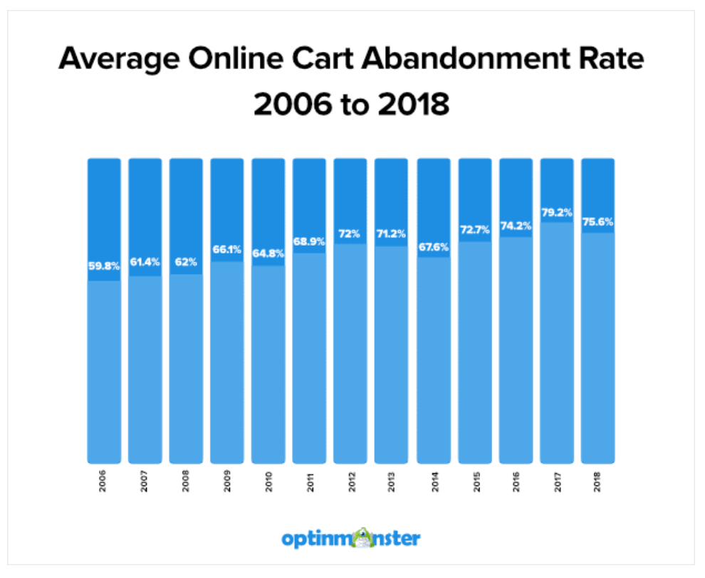
76 out of every 100 visits abandon their carts. Do you have any idea why? The answer is pretty simple: they’re not impressed. A report by Optin Monster shows how the average cart abandonment rate has increased throughout the years.
First impressions play a key role in the success of your store. You need to give off that wow factor in order to stay ahead of your competitors. A higher-quality store design will likely gain better trust from new customers than a store with pixelated content, poorly written copy, and an experience that’s just hard to navigate through. Quality is key, and it’s often the deciding factor for the amount of trust a consumer will have when buying from you.
How can a good UI create a better eCommerce experience?
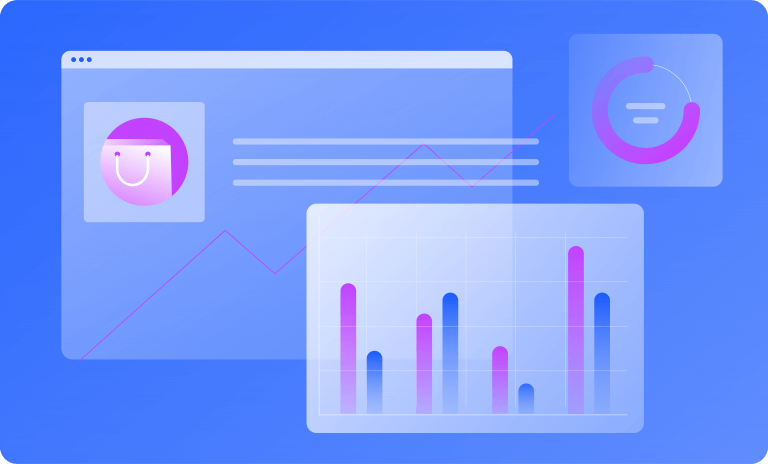
First of all, let’s quickly sum up the differences between UX and UI. UX stands for user experience. It’s the experience users have with your product pages and any other store functionality. UI stands for the user interface. The UI of a page is what you see visually such as the color, use of images, fonts, and general layout of a page.
If you hire a UI designer, then they’ll be thinking about the layout of your product page or the color and sizing of your buttons. A UX designer will be thinking about how the experience makes the user feel.
When designing the eCommerce UI design of your store, you need to consider several key factors:
- Clear presentation for menus, product pages, and checkout pages
- Strong branding
- A specific design that supports your offer, and doesn’t overshadow it
- Operational simplicity
- Easy-to-access functionality
- Reliable eCommerce security
A well-designed store should also make use of clearly labeled CTAs (call to action). Sometimes a graphic just isn’t enough to represent functionality on your site. Calls to action are one of the best ways to provide a well-labeled user experience.
Here are five profitable strategies for eCommerce UI design:
1. Use a landing page for a specific purpose
Sometimes sending users to your homepage may cause them to feel overwhelmed, distracted, and even frustrated. It’s one of the steps that can kill the profitability of your site. It’s advisable to use landing pages when you need to concentrate the users’ attention on something specific. A good example of this could be when you are running PPC campaigns. You’ll likely find that your campaign’s overall conversion rate increases when using this strategy.
By sending PPC traffic to a landing page, you have the ability to serve the traffic with content that is more relevant to the ad you are running. Using a landing page should reduce the bounce rate whilst also increasing your conversion rate.

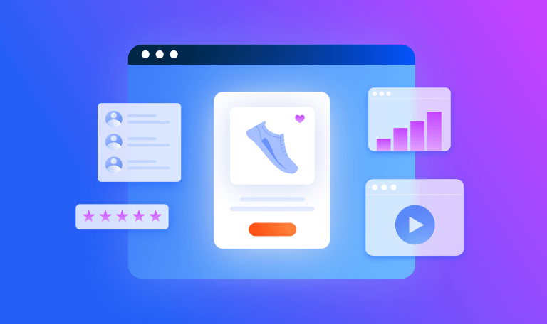
2. Use high-quality images to deliver your message
The vast majority of users are visually driven. Show them an image that is both informative and emotionally appealing and you’ll likely have a better connection between your brand and customers. Some common visual elements on your site could include:
- Photos: Create themed photos to promote the appropriate mood and set the right message. These could include demonstration photos, photos of your products, and even photos of special offers.
- Hero banners: These are the big images that are usually the first visual elements to catch the users’ attention. Hero images are often used to give an attractive visual presentation of the main focus on your page.
- Illustrations: Creating your own illustrations can look informative and more original, helping your design stand out from the competition.
3. Minimize users’ efforts when possible
Aside from saying thank you to your customers, real respect shines through when you aim to save your customers time and effort.
Ways in which you can do this include:
Showing related products: Often shown on the product page, a simple feed of products related to the product that users are currently viewing can make the process of searching for similar products much faster — turning visitors into customers.
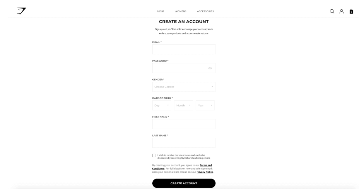
Simplify the login process: It’s important to make the sign-in/login-in process as simple as possible. You want your customers to reach the checkout stage in the quickest and simplest way possible, eliminating any excuses or reasons for them not being able to checkout.
4. Good mobile optimization is key
According to our eCommerce benchmarks data, 63% of web traffic to eCommerce stores and 53% of sales happen via mobile, yet there are still many sites that aren’t optimized for mobile. When designing your site, consider using a grid layout, as this will help you stack the content of your page for mobile users. It’s also a good idea to have a navigation bar that has sticky positioning. This means that as users scroll around the site, the “add to cart” icon or CTA will always follow them, ready for them to begin the checkout process at any moment.
5. Make the branding clear
Good branding is a must for all eCommerce companies. It’s also a crucial thing if you want to provide a recognizable face and personality for your product and site.
The interface of your site should use the right color palette, shapes, typefaces and fonts, illustrations, and icons. Branding is usually seen as an essential part of eCommerce UI, and having your brand identity integrated thoughtfully across your site is an effective way to increase brand awareness.

Using page builders to create a beautiful UI
For those who aren’t designers, or don’t have the budget to hire a designer, then your best option would be to use a page builder. There are many options out there, such as Shopify, Squarespace, and Webflow, but one of the top favorites is Zyro.
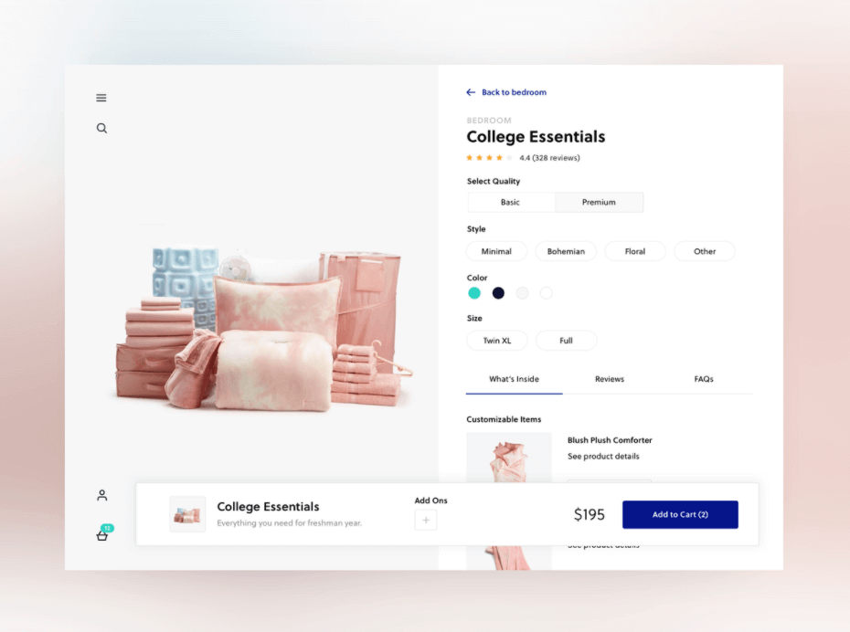
Zyro makes it easy to launch an eCommerce site within minutes. The biggest advantage you have with Zyro compared to other store builders is that you have access to some great templates that are fully customizable. Each of their templates is responsive, which means a guaranteed great user experience across all device sizes. Here’s a peek at some of their eCommerce templates.
Final points to consider:
- Keep the branding consistent: just like how you keep your social media content and product designs consistent, you need to keep the different page designs, fonts, and content consistent throughout your site.
- Keep the experience fresh: it’s a great idea to occasionally make minor changes to your design and layout, as it can give the feeling of refreshment. Think about how physical stores change the retail mannequins often to stay up to date with the seasons and trends.
- Check your mobile experience: be sure to regularly check your site across different devices to avoid any new customers experiencing bugs with your site’s layout or content.
- Think outside of the UI: your site may be lacking in areas other than just the need for a better eCommerce UI. For example, you may see lower conversions because of insufficient reviews or other factors, such as a problem with your eCommerce store’s checkout process. Check out our article on how to optimize conversion rates for more sales.

Related Posts


Black Friday: Amazon Reigns, But Value Players Are Rising (Fast)

How to Do an Amazon Seller Competitor Analysis in Under 30 Minutes

Live Black Friday Morning Search Trends: What’s Winning Right Now

What Is Amazon Rufus and How Will It Change the Shopping Experience?
The ultimate edge in marketplace intelligence
Put the full picture at your fingertips to drive product views and sales