eCommerce Conversion Rate Optimization: 15 Tips to Grow Sales
Imagine this: Last week, your website converted 20 leads on Wednesday, 15 leads on Thursday, and 35 leads on Friday. What does this really mean? Is it good? Bad? Neutral?
To be honest, it all depends on your conversion rate.
If you usually get less than 50 visitors a day and sell to one of them, last week’s website performance would be phenomenal. However, if you normally sell to hundreds of people a day via your website, last week’s dip in traffic would be concerning.
So, what exactly is a conversion rate, and how can you make it work for you?
That’s what this article is all about. Specifically, we’ll cover the ABCs of Conversion Rate Optimization (CRO), including 15 tips to help you boost website conversions.
 There is no one list of strategies for eCommerce conversion rate optimization. Instead, every company adapts common strategies so they align with three key elements:
 Optimization and conversion analysis helps:
 For example, if your website got 10,000 visits and 150 conversions in January, your conversion rate would be 1.5%.
As I mentioned in the introduction, conversion numbers only mean something in context. So, you’d need to look at November, December, and February’s conversion rates to see if January was a good month for conversions.
Alternatively, you can compare your figure to industry averages. After all, if you aren’t benchmarking against your competitors, how do you contextualize your own website performance?
Let’s look at an example.
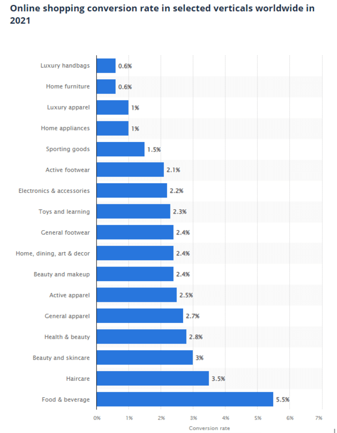
A study conducted by Statista in 2021 looked at 22 billion website visits from one billion shoppers. These shoppers bought from 1,989 websites in 51 countries. The study found that the food and beverage industry had the highest conversion rate – 5.5%. The home furniture and luxury handbag industries had the lowest conversion rates – just 0.6%.
The rest fell in between, as you can see below. In this case, after benchmarking, we know a conversion rate of 0.7% would be exciting for a home furniture website, but a real bummer for a food and beverage website. See? Context matters.


 There’s an art to A/B testing, so make sure you follow these best practices:
 The trick with trust signals is adding enough that your audience feels safe but not overdoing it (as this will make your signals seem inauthentic). For best results, show, but don’t be showy. For example:
 To put the importance of mobile sales into perspective, consider this: in 2022, 40.1% of eCommerce sales will be made through a mobile device.
So, what does “mobile-friendly” mean for your site?
First, you need to choose a mobile-responsive theme that will scale down to the size of a mobile screen smoothly.
Then, you need to consider the user experience (UX). Try browsing your website on mobile and note anything that makes it difficult. For example, maybe your menu isn’t visible, or your headings take up too much of the page. If something annoys you, it’ll definitely frustrate customers.
Here are some additional elements you can alter to improve your website’s mobile experience:
 Then, revisit your website and add keywords to each page. Here are some places you can put keywords:
 Pro Tip: Don’t use more than one primary keyword per page. Otherwise, you risk keyword cannibalization (when multiple pages rank for the same keyword, thus performing worse in SERPs).
 You don’t need to edit your photos heavily to make them look good. Instead, select a standard filter you can apply to all branded photographs to make them look professional and consistent.
 If you don’t know which of your pages performs best, you can track it via Google Analytics or Google Webmaster Tools.
Once you understand how customers like to shop, you can optimize the sales experience to up-sell and cross-sell them, ultimately boosting your conversion rate and average revenue per customer.
 Starting a loyalty program is fairly easy. You can do it via email marketing or with off-the-shelf software options.
However, you mustn’t make your program mandatory for customers. Thirty-two percent of Retail Info Systems’ study participants previously abandoned a purchase because they were forced to create an account on the seller’s website.
Customers may not want to create an account for many valid reasons. You should offer them the benefits of making one, but don’t force their hand – you might lose the sale if you do.
 You can do something similar on your website. Using text, images, colors, white space, and other elements, you can create a visual hierarchy that directs people to elements that will keep their attention, like sale banners, a key product you want to promote, or a piece of marketing.
Additionally, you can take advantage of the areas people default to. Many visitors follow the “S” pattern and snake their way down the page right-to-left. Other visitors follow the “F” pattern.
Some research also shows that the left side of the screen often gets more attention than the right. One study by the Nielsen Norman Group even found that people view the left side up to 60% more.
To find the right layout to drive conversions on your site, use heat maps to find the areas visitors prefer. Then, adjust your design to match.
What is eCommerce conversion rate optimization (eCRO)?
eCommerce conversion rate optimization or “eCRO” may sound like a buzzword, but it isn’t. It simply refers to the practice of adjusting elements of your eCommerce website to increase the rate at which visitors take a desired action (aka, convert).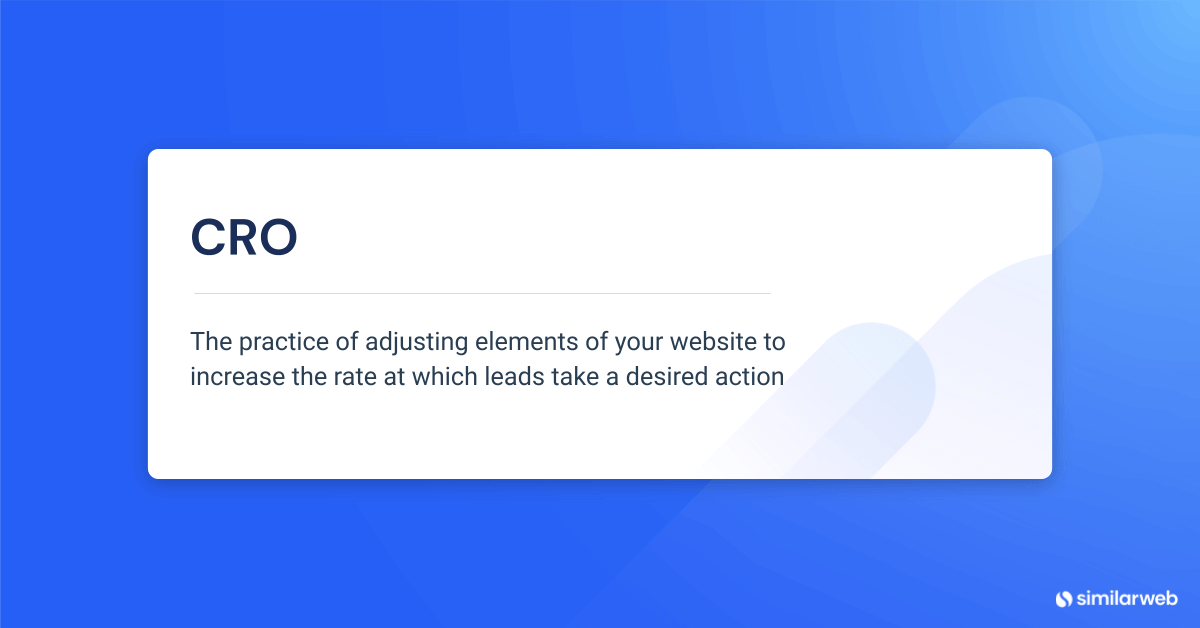 There is no one list of strategies for eCommerce conversion rate optimization. Instead, every company adapts common strategies so they align with three key elements:
- Their branding
- Their customers
- Their long-term marketing goals
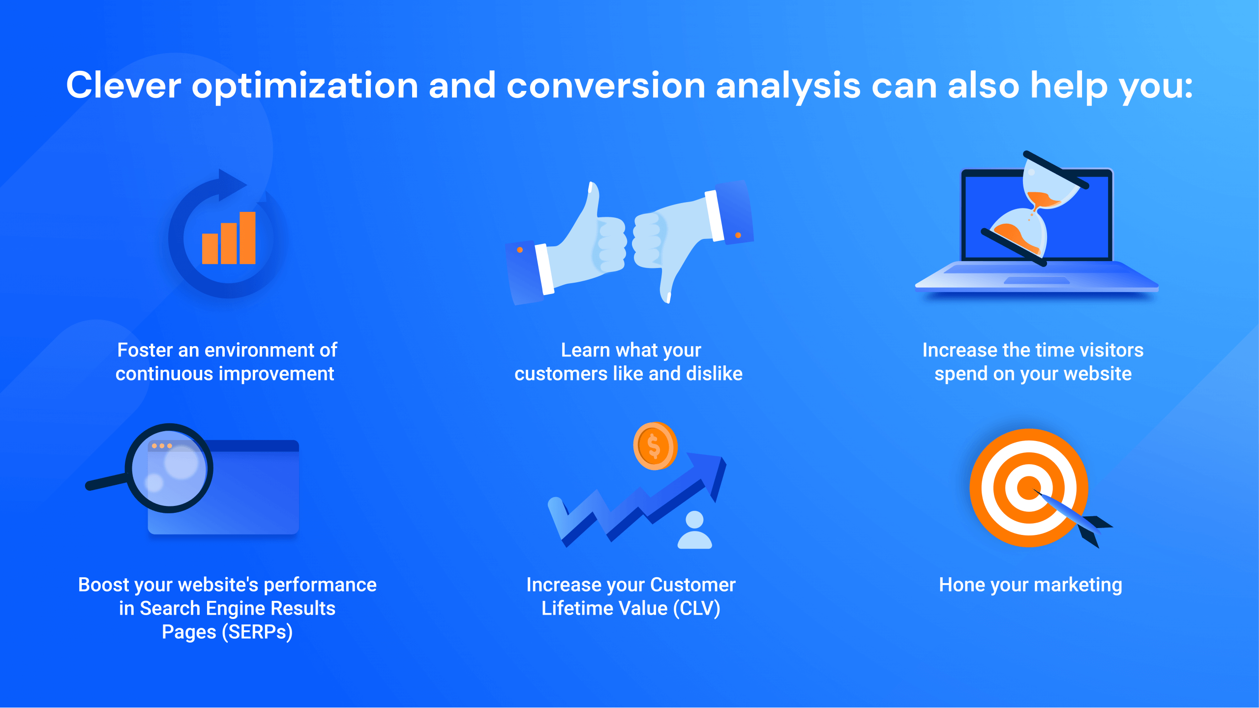 Optimization and conversion analysis helps:
- Increase the time visitors spend on your website – boosting your content marketing results and website engagement metrics
- Foster an environment of continuous improvement
- Learn what your customers like and dislike
- Boost your website’s performance in search engine results pages (SERPs)
- Hone your marketing
- Increase your customer lifetime value (CLV)
How is eCommerce conversion rate calculated?
Calculating your eCommerce conversion rate is one of the easiest parts of any eCRO strategy. You’ll need two figures: how many people converted and the total number of website visitors. You can track these figures using an analytics tool like Similarweb Digital Marketing Intelligence. You can calculate your conversion rate overall or for a set period (for example, per day, week, month, quarter, year, etc.). It doesn’t matter which period you opt for, as long as you use the same period for both the “conversions” and “total visits” figures (because if your time periods don’t match, your rate will be inaccurate). Once you have your figures, simply apply this formula: Conversion rate = (Conversions ÷ Total Visits) x 100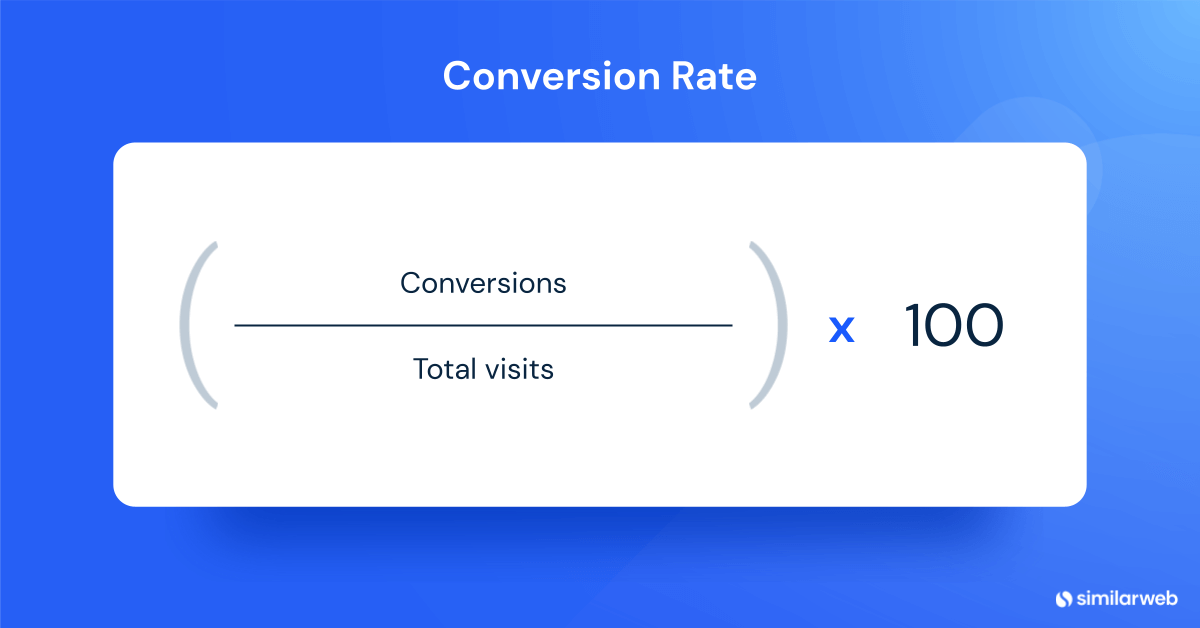 For example, if your website got 10,000 visits and 150 conversions in January, your conversion rate would be 1.5%.
As I mentioned in the introduction, conversion numbers only mean something in context. So, you’d need to look at November, December, and February’s conversion rates to see if January was a good month for conversions.
Alternatively, you can compare your figure to industry averages. After all, if you aren’t benchmarking against your competitors, how do you contextualize your own website performance?
Let’s look at an example.
A study conducted by Statista in 2021 looked at 22 billion website visits from one billion shoppers. These shoppers bought from 1,989 websites in 51 countries. The study found that the food and beverage industry had the highest conversion rate – 5.5%. The home furniture and luxury handbag industries had the lowest conversion rates – just 0.6%.
The rest fell in between, as you can see below. In this case, after benchmarking, we know a conversion rate of 0.7% would be exciting for a home furniture website, but a real bummer for a food and beverage website. See? Context matters.
eCommerce conversion rate optimization tips
Now that you know how to calculate your conversion rate and what the average rate for your industry is, you know whether you stand above the competition or beneath it (for now). Either way, there are many strategies you can try to improve eCommerce conversions long-term. Here are 15 of our favorites.1. Understand your users
This tip is first because it applies to every business and industry. If you don’t understand your customers, you won’t know their pain points, what they want, and what makes them convert. A failure to understand customers also has dire consequences. Research on 111 failed startups showed that 35% listed “no market need” as a top reason they failed (meaning their product didn’t provide customers with something of value). Try these data-gathering techniques to help you find your market’s needs:- Ask customers questions via a survey
- Invite loyal customers to a focus group
- Ask customers for feedback after a live chat, email, or phone interaction with customer service
- Watch for industry trends using tools like Google Trends
- Look at what your audience engages with on social media
2. Look for sale-stopping barriers
There’s a reason every lead that failed to convert did so. A user may have realized they simply didn’t want the product, or they couldn’t afford it. You can’t fix all the reasons people don’t convert, but you can remove the barriers that stop otherwise interested leads from clicking “buy now.” Here are four common sale-stopping barriers and how to fix them:1. The checkout process was too long
A study of consumers from Retail Info Systems in the United States, Canada, United Kingdom, Australia, and Mexico found that 35% of consumers have abandoned an online retail transaction because the checkout process was too long. The solution here is simple: shorten the process by collecting the data you need and spice up your form to keep it engaging. Additionally, use a progress bar to show the lead how close they are to the end – aka the light at the end of the funnel.2. Something in the sales process upset the lead
In Retail Info Systems’ study, 69% of consumers admitted to ditching an order because the shipping was too expensive or would take too long. Though these may seem like minor details to retailers, they can ruin the customer experience. You can’t always fix shipping issues, but you can incentivize leads to stay. For example, you could offer a low-cost item for free or provide a 5-10% discount if customers need to wait more than a month for their order.3. The lead got confused
Sometimes, leads leave websites because the information is too overwhelming or they need to make too many decisions to buy a product. To fix this, simplify your web pages to prioritize the most important information. For example, reduce visual clutter, place white space around your widgets, and limit distracting sections like the “special discounts” widget to one to three products.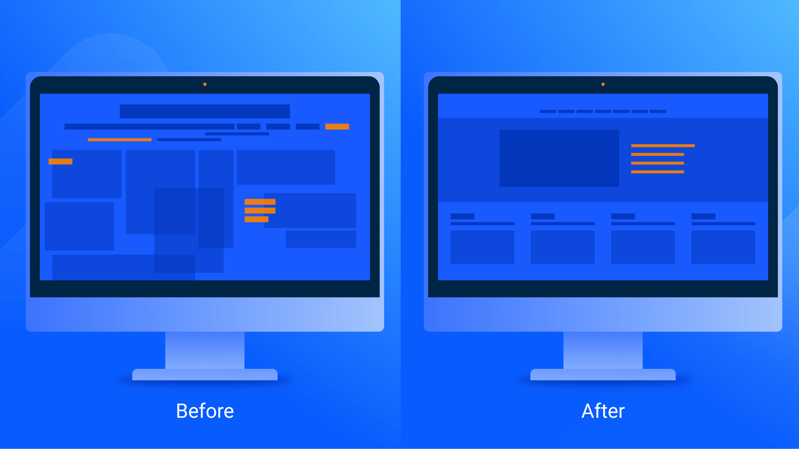
4. The lead never got emotionally attached to your brand
Finally, some leads never get invested in your product because your website isn’t exciting and welcoming. Fix this by adding warmth to your site with color, friendly language, and inviting touches like a “welcome” pop-up. For inspiration on creating a welcoming website, look to the toilet paper company “Who Gives A Crap”. Its website draws people in with design choices that grab attention and then offers them a $10 off coupon.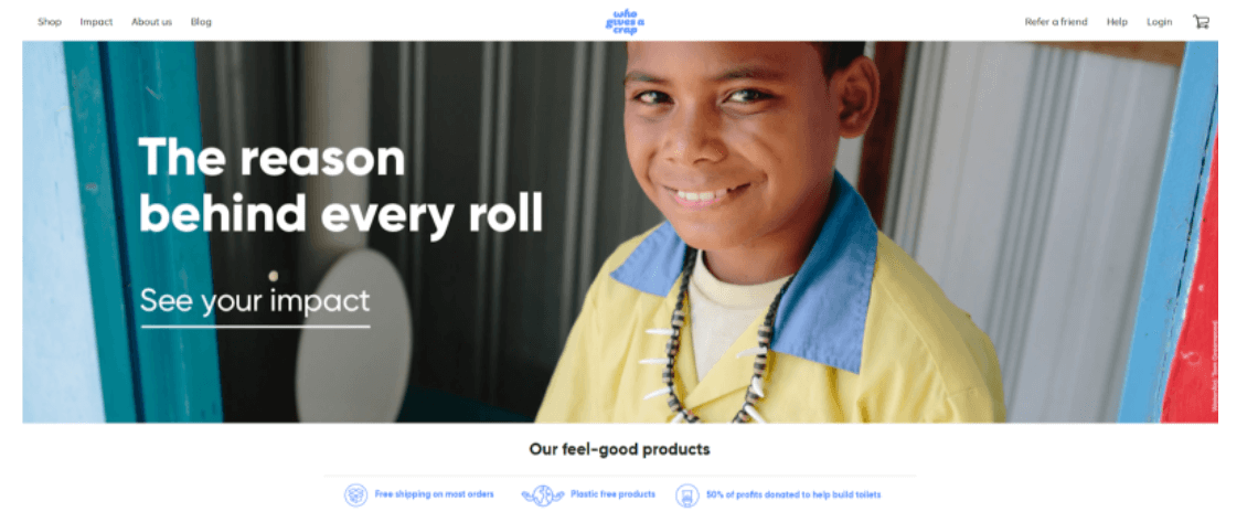
3. Conduct A/B tests
Website details like headings, sales copy, and the language in your call-to-actions (CTAs) may seem minor, but they influence how your visitors respond (and thus, convert). A great way to find what works for you is A/B testing. A/B testing is a research technique that compares two similar assets with minor differences. To conduct an A/B test, select something for A (the control) and B (the challenger). Then, choose an eCommerce metric for measurement and an experiment duration period. Finally, collect your data. Not nearly as hard as it sounded, right? For example, you could compare the headline “Welcome! Please Browse Our Tea Candles” to the headline “Welcome! Let Us Show You Our Tea Candles” using your sales conversion rates in two 24-hour periods. This test would tell you how the wording of the welcome banner influences sales.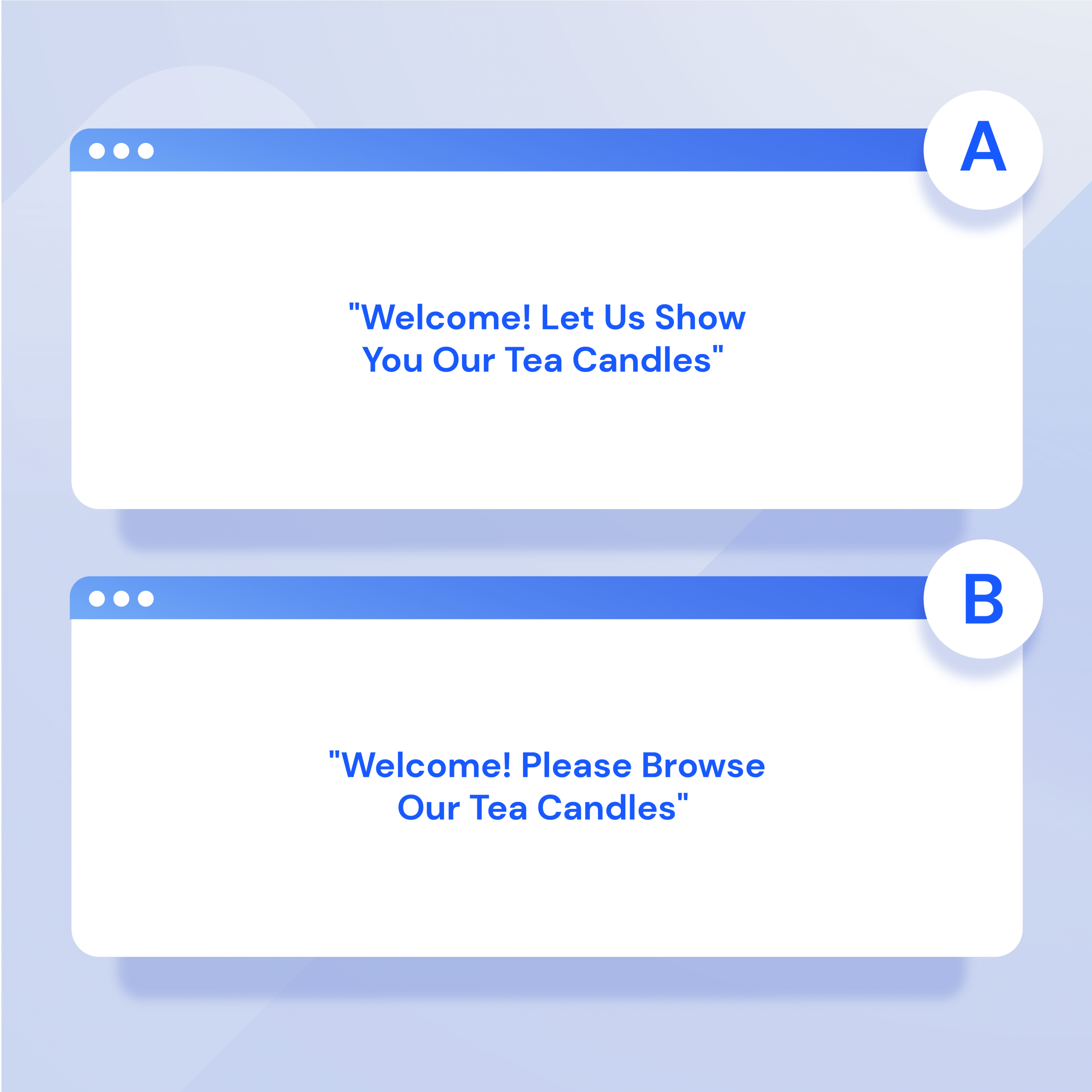 There’s an art to A/B testing, so make sure you follow these best practices:
- Make sure the control and challenger are identical except for the variable you’re testing for
- Account for seasonal fluctuations in your data (because you’d get inaccurate results if you compare sales conversions during a busy period like December with a quiet period, for example).
- Only test one element at a time (so you know for sure what makes your metrics change)
- Store your data somewhere secure (so you can refer back to it later)
4. Place trust signals on your site
Have you ever visited a website and found a product you liked, but ultimately walked away from the transaction because the website felt “off?” This experience is very common. Many online shoppers have either been ripped off by a retailer or know someone who has. Naturally, consumers are vigilant and look for red flags that a website is bad news. You can check for these red flags on your website, and if you notice them, fix them ASAP. Here’s a short list to look for:- No “about us” page
- No phone number, email address, or physical address for the business
- No prices (or scammy pricing practices)
- A lack of documentation on warranties, returns, and shipping policies
- Broken links
- Unfinished pages
- A spammy URL (for example, “fitnessgear.com” vs. “f1tn3ssg3ar.com”)
 The trick with trust signals is adding enough that your audience feels safe but not overdoing it (as this will make your signals seem inauthentic). For best results, show, but don’t be showy. For example:
- Show positive reviews, but don’t delete negative ones
- Choose testimonials that are positive, but not ones that gush too much
- List achievements, but don’t brag
5. Go mobile-friendly
Mobile devices now play a key role in online retail sales, so making your website mobile-friendly is a foolproof strategy to improve eCommerce conversion rates. According to eMarketer’s “Rise of mCommerce: Mobile eCommerce Shopping Stats & Trends in 2022” report, shoppers in the U.S. spent $359.32 billion on retail sales via their mobile phones in 2021. In 2019, this figure was just $220.67 billion, and by 2025, eMarketer expects it to rise to $728.28 billion.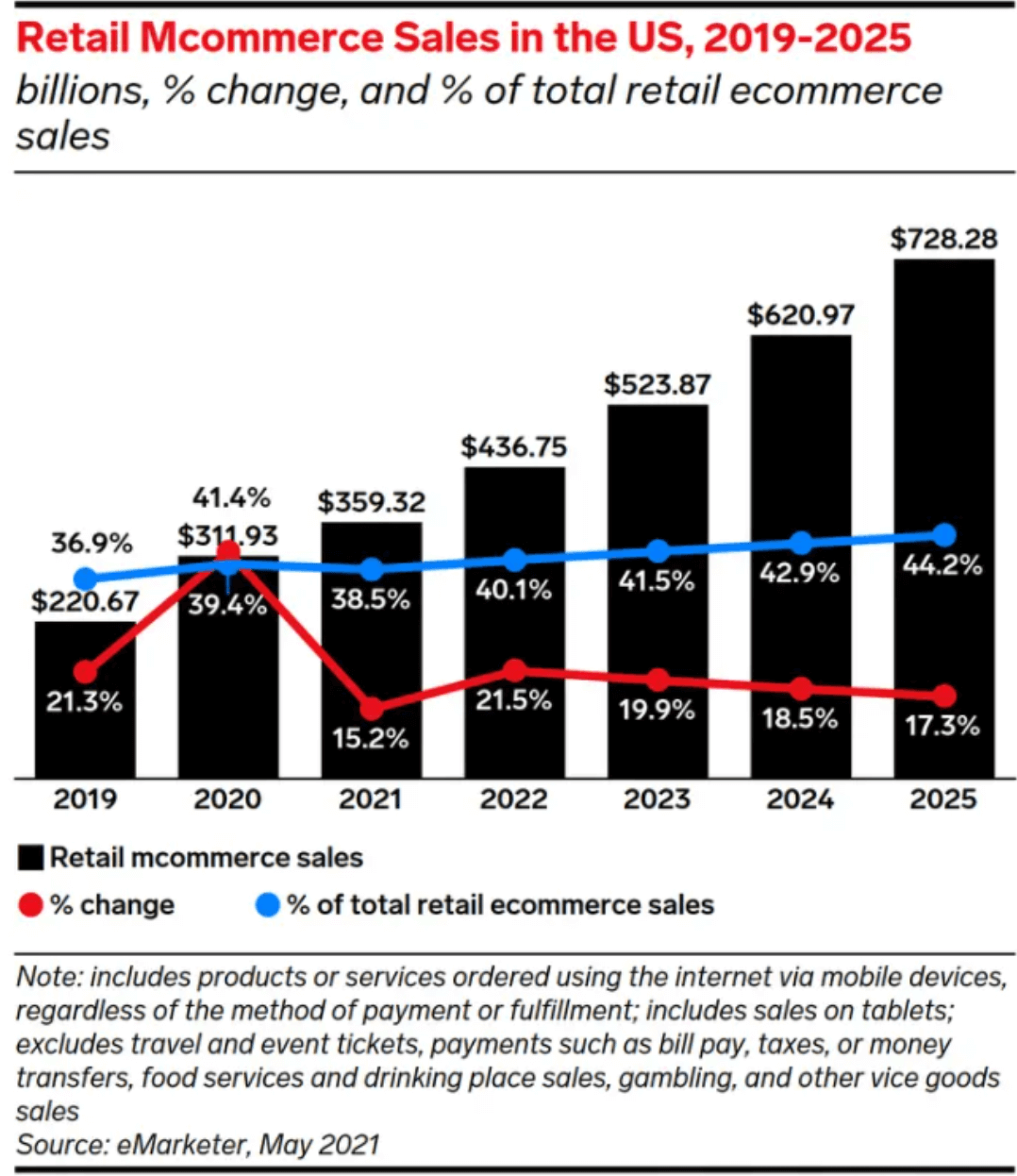 To put the importance of mobile sales into perspective, consider this: in 2022, 40.1% of eCommerce sales will be made through a mobile device.
So, what does “mobile-friendly” mean for your site?
First, you need to choose a mobile-responsive theme that will scale down to the size of a mobile screen smoothly.
Then, you need to consider the user experience (UX). Try browsing your website on mobile and note anything that makes it difficult. For example, maybe your menu isn’t visible, or your headings take up too much of the page. If something annoys you, it’ll definitely frustrate customers.
Here are some additional elements you can alter to improve your website’s mobile experience:
- Make your buttons larger (so they’re easy for people with large fingers to press)
- Reduce how much text you use
- Avoid using Flash
- Increase the space between your links (so people don’t accidentally press the wrong one)
- Use accessible fonts
6. Optimize with keywords
Keywords are called keywords for a reason – they’re key in bringing customers to your website, so you’d be wise to leverage them. The Similarweb keyword tool can help you perform keyword research to find the perfect words for your site. Specifically, it shows any keyword’s traffic volume, cost-per-click (CPC), paid traffic, organic traffic, related keywords, and domains that currently rank highly for the keyword. If you’d like to learn more about the Similarweb Keyword Generator, try it yourself.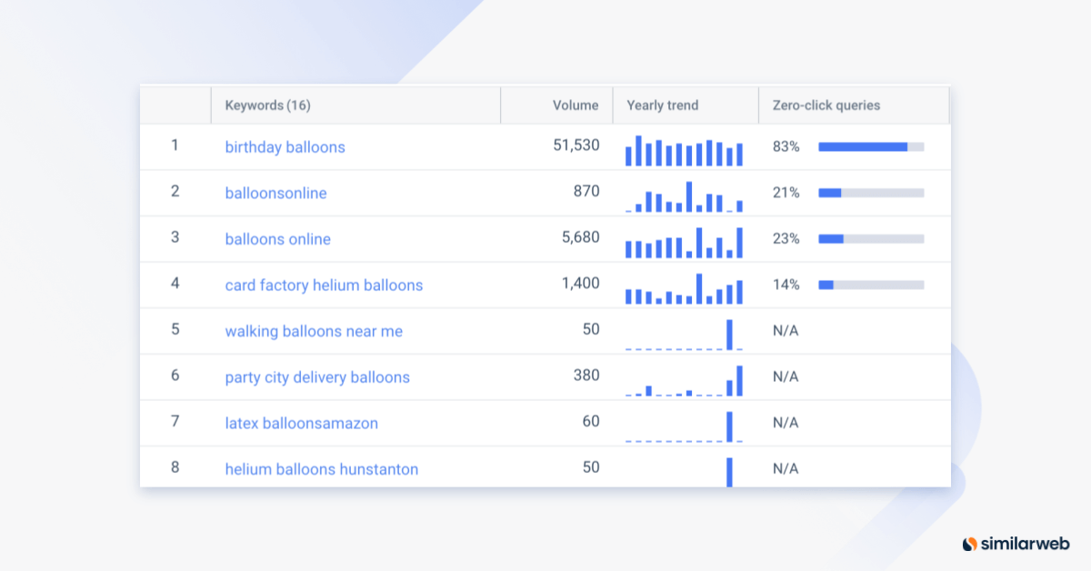 Then, revisit your website and add keywords to each page. Here are some places you can put keywords:
- Product category pages
- Product titles or page headers
- Product descriptions
- As alt text for product images
- In the webpage URL
- In supporting blog content
 Pro Tip: Don’t use more than one primary keyword per page. Otherwise, you risk keyword cannibalization (when multiple pages rank for the same keyword, thus performing worse in SERPs).
7. Invest in high-quality product photos
Once you’ve optimized the text on your website, turn your attention to images. Product images tell customers vital things about your product. They indicate quality, product uses, and ideal customer. In essence, they help customers visualize what owning the product would be like. Naturally, you want to make that vision positive to boost conversion rates. To improve your photos, consider hiring a professional photographer. Or, if that’s out of budget, dust off your camera lens and take a nice shot with ambient lighting. Take multiple pictures, place other props within the frame, and get photographs of your product in action to get the best shot possible. Additionally, make sure customers can clearly see the size and quality of your product – like in this shot of a spatula from How To Cake It: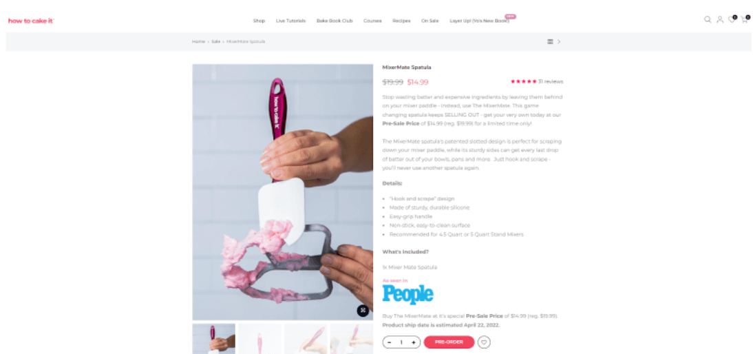 You don’t need to edit your photos heavily to make them look good. Instead, select a standard filter you can apply to all branded photographs to make them look professional and consistent.
8. Get a live chat service
Retail stores have always had a friendly advantage over eCommerce stores because salespeople can engage customers by speaking with them. You can win this advantage back by adding a live chat service to your website. Adding live chat will prompt customers who might otherwise leave your website the chance to resolve the issue that’s inspiring them to click out. They can ask a live agent questions about the fit of a pair of jeans, for example, or find out how long shipping will take. Live chat agents can also use person-to-person selling techniques to make the sale – like offering a limited-time-only discount or giving the visitor a 10% off coupon. You don’t need a web developer team or an unlimited budget to connect a live chat service to your website. Many off-the-shelf Software-as-a-Service (SaaS) options work with any website, or you can download a WordPress plugin (if your website is part of the 43% of websites that use WordPress).9. Leverage top-performing pages
If your website is like most websites, you’ll have some pages that draw in a lot of traffic and others that attract limited traffic. A great way to increase eCommerce conversions is to use your high-performing pages to funnel traffic around your site. One way to do this is by placing internal links strategically. You could, for example, add banners linking to other pages to the side of your webpage. Or link the page within the text. Alternatively, if your top-performing pages are product pages, you can market other products through a “customers who bought this also purchased” style widget. Clothing brand The Lullaby Club uses a widget like this that shows customers items in a similar style and price range. If you don’t know which of your pages performs best, you can track it via Google Analytics or Google Webmaster Tools.
Once you understand how customers like to shop, you can optimize the sales experience to up-sell and cross-sell them, ultimately boosting your conversion rate and average revenue per customer.
10. Fix site problems
This tip may seem obvious, but it’s very important. Problems that interrupt the user’s experience on your website will decrease your conversion rate, as frustrated visitors will leave. So, you must address website issues (particularly if you’ve noticed a recent drop in conversions and don’t know why). Here are some site issues to look for:- You’re using HTTP instead of HTTPS
- Your website has broken links
- Your images aren’t loading
- Your buttons aren’t working
- Your pages have spelling or grammar mistakes
- You only offer outdated information
- Your website navigation is too confusing
11. Research your competitors
If you learn why customers buy from competitors, you can use the insights to make your brand more attractive so that they buy from you instead. Browse your competitors’ websites and pay attention to how they market their products. Do they use keywords you don’t? Do they offer better value? How do they position their brands? Similarweb Conversion Funnel & Customer Journey Analysis tool is your friend here. It will help you understand your customers’ journey, find product search trends, spot meaningful touchpoints, and identify your competitors’ strategies.12. Start a customer loyalty program to retain customers
You’ve likely heard “it’s better to sell to a loyal customer than an existing customer” before. And it’s true, brand loyalty matters. One of the most well-known pieces of research to look at this phenomenon came from a collaboration between Bain & Company and Earl Sasser from Harvard Business School. This research found that increasing retention by 5% increases profits by 25%+. Several years later, another key piece of research by Alan E. Webber found that increasing retention by 2% improves profits by the same amount as reducing costs by 10%. The logic in both studies was that customers return to companies they trust, and thus, retention drives sales. So, how do you keep your customers coming back? One sure way is with a customer loyalty program. Customer loyalty programs reward customers with free gifts, discounts, and exclusive offers. They let customers in on a “secret club,” and in turn, customers feel valued and appreciated. One example is Amazon’s Subscribe & Save program, which lets customers sign up for regular shipments of products like pet food at a discount. Let’s look at another example from a marketing angle. Consider the language and color CocoKind uses in the image below. It’s powerful and inviting.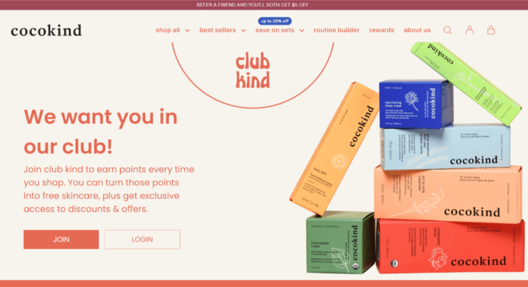 Starting a loyalty program is fairly easy. You can do it via email marketing or with off-the-shelf software options.
However, you mustn’t make your program mandatory for customers. Thirty-two percent of Retail Info Systems’ study participants previously abandoned a purchase because they were forced to create an account on the seller’s website.
Customers may not want to create an account for many valid reasons. You should offer them the benefits of making one, but don’t force their hand – you might lose the sale if you do.
13. Speed up your website
A 2017 Google study of 3,700 mobile webpage sessions showed that 53% of visitors clicked off a website if it took more than three seconds to load. Pushing a potential customer away from your website has lasting ramifications. If you provide customers with a poor experience once, they’re less likely to return. So, how fast should your website be? Google’s former employee Maile Ohye advises that eCommerce retailers should speed up their websites to load in two seconds or less. Other experts like Pingdom and WebFX say one to two seconds. You can test your website speed using tools like Google PageSpeed Insights, Pingdom, or GTMetrix. These sites will suggest ways to increase your website speed, but here are some additional ideas to try:- Reduce page redirects
- Take advantage of browser caching
- Allow compression
- Optimize images for search engines
- Reduce HTTP requests
- Minify HTML, JavaScript, and CSS files
14. Use design to your advantage
Your website’s design doesn’t just make it look aesthetically appealing. It also influences where visitors look on the page. Consider, for example, the layout of the Frans Hals Museum’s website. This website uses the “Welcome” header, deliberate shading, and bright colors to shift the visitors’ attention to the “Buy Tickets” and “All Exhibitions” buttons. You can do something similar on your website. Using text, images, colors, white space, and other elements, you can create a visual hierarchy that directs people to elements that will keep their attention, like sale banners, a key product you want to promote, or a piece of marketing.
Additionally, you can take advantage of the areas people default to. Many visitors follow the “S” pattern and snake their way down the page right-to-left. Other visitors follow the “F” pattern.
Some research also shows that the left side of the screen often gets more attention than the right. One study by the Nielsen Norman Group even found that people view the left side up to 60% more.
To find the right layout to drive conversions on your site, use heat maps to find the areas visitors prefer. Then, adjust your design to match.
15. Offer multiple payment options
Finally, diversify the ways customers can pay so people can select the option they’re most comfortable with. Though some customers prefer well-established payment options like Visa, Mastercard, or AMEX, others prefer digital wallets. In fact, Retail Info Systems’ data shows that 71% of consumers will “sometimes or always” use digital wallets when provided the option. Specifically, they prefer Apple Pay, Amazon Pay, PayPal, or Google Pay. Digital wallets aren’t going away anytime soon. At the end of 2021, PayPal alone had 426 million registered accounts – up from 106.3 million accounts ten years before. You don’t need to just provide multiple payment providers to give customers options. Instead, consider offering different payment structures. Here are a few to consider:- Buy Now, Pay Later (BNPL). BNPL payments allow customers to pay in small installments.
- Layby. Layby payments allow customers to purchase an item now and pay at a set date (or multiple).
- Subscriptions. Subscriptions allow customers to pay a recurring fee for ongoing goods and services.
- Prepaid in-store cards. Prepaid in-store cards allow customers to load their loyalty cards with money and use them in-store for payments, like gift cards.
eCommerce conversion optimization: your secret to sales
eCommerce CRO is the secret ingredient that will turn your website into a sales machine. Investing in a CRO strategy can be time-consuming, but it’s worth it. Long-term, a CRO strategy can grow your target market, close sales, and lift your revenue. To improve the conversion rate for your eCommerce website, try these strategies:- Make your website mobile-friendly and accessible for users
- Add trust signals
- Improve website speed and design
- Offer multiple payment options
- Adjust your listings with high-quality photos and trending keywords
FAQ
What is an eCommerce CRO Strategy? A conversion rate strategy is a set of actions you take to increase the number of visitors who convert to leads or customers on your website. What is a good conversion rate for eCommerce? Many factors, including branding, time of year, customer preferences, and economic factors, influence conversion rates. A “good” conversion rate is one that’s higher than your average conversion rate Why is conversion rate optimization important in eCommerce? Conversion rate optimization is important in eCommerce because it increases the number of visitors who become leads or customers for your brand. This increase will grow your brand’s sales, reach online, and customer base.
This post is subject to Similarweb legal notices and disclaimers.
The ultimate edge in marketplace intelligence
Put the full picture at your fingertips to drive product views and sales
Would you like a free trial?
Wouldn’t it be awesome to see competitors' metrics?
Stop guessing and start basing your decisions on real competitive data
Now you can! Using Similarweb data. So what are you waiting for?


